KIYOSHI AWAZU: REVOLUTIONIZING JAPANESE GRAPHIC DESIGN
Kiyoshi Awazu defies our expectations of Japanese aesthetics.
He built a new world for graphic design with psychedelic symbolism, mad colour pallets and political advocacy.
When we think about Japanese design aesthetics, we often associate it with simple, minimal, and self-contained expressions. In our mind, Japan's design practice is easily recognizable by its Zen Culture-ish visuals, a style that relays in calm motives, less-is-more thinking, and a lot of negative space as essential qualities. Awazu was a graphic designer who revolutionized this tradition. Someone who exchanges simplicity over psychedelic chaos. A mastermind who created a new path for vernacular iconography and, in the way, based the founding of modern design culture in Post-World War II Japan.

(1970)
Who is Kiyoshi Awazu?
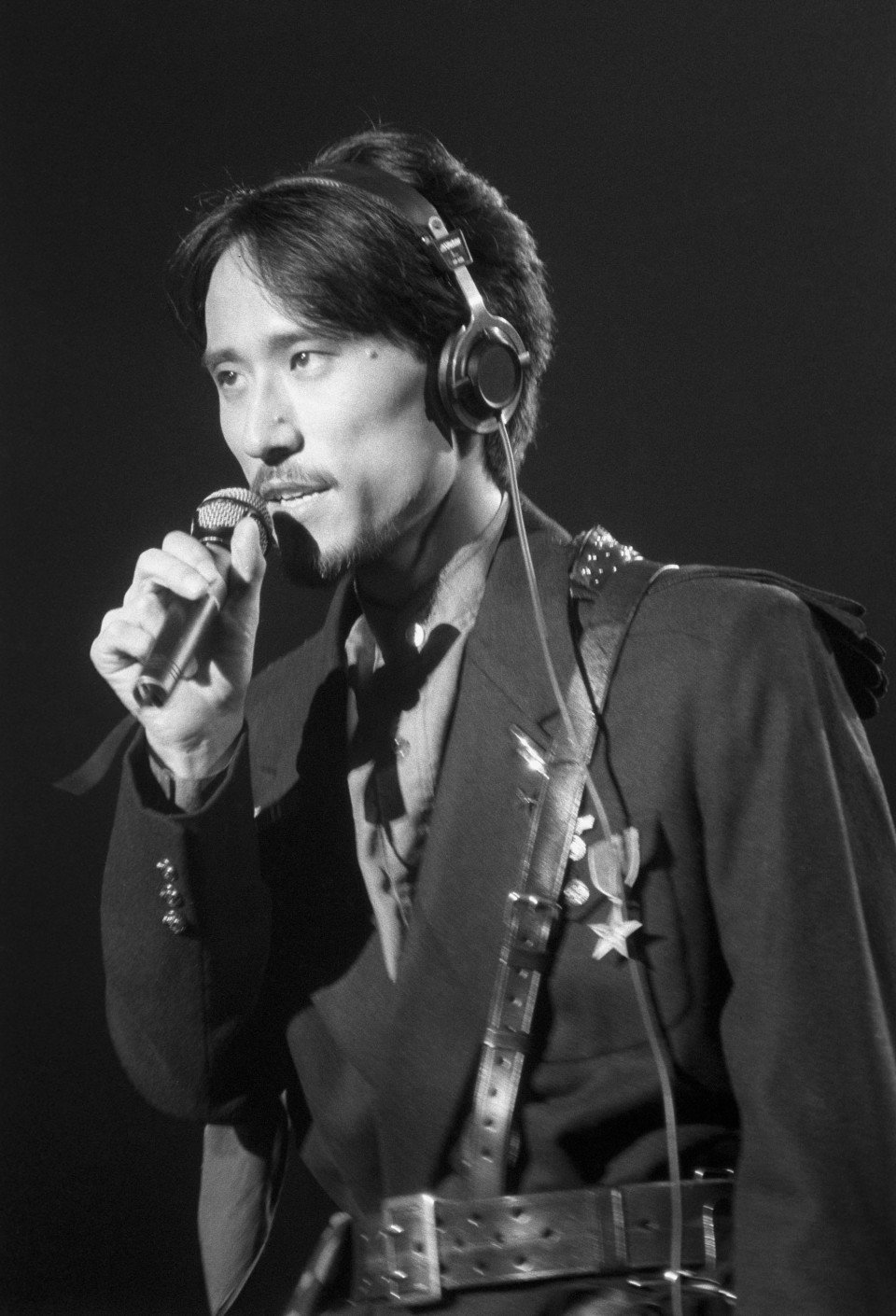
Awazu is a stellar figure in Japanese graphic design history. Born in 1929, he is a self-taught painter and graphic designer known for his genre-bending bodywork. From painting to posters and theatre to architecture, his creative passion did not meet boundaries.
In a context where aggressive change was a palpable threat to folklore values, the designer's vision focused on rescuing traditional art forms, using historical printing methods to illustrate modern symbolism, but also as an occasion to expressed social commitment.
His style represented a statement against modernist dogmas that pursue the internationalization of soulless symbols. In his own words, the designer's mission was 'to extend the rural into the city, foreground the folklore, reawaken the past, summon back the outdated.'

Kiyoshi Awazu

Seishū Hanaoka's Wife (1970)
Give Back Our Sea
In over 60 years of activity, Kiyoshi Awazu built a reputation for experimenting with a vast range of visual formats, but also, collaborating with a big network of artists and architects – the Metabolism architecture collective as an example. But most of his creations are concentrated in the film industry, specifically in film advertising design posters.
Our story began in 1954 when a young Awazu joined the advertising department in a film company called Nikkatsu. Hired just as a part-time worker, he was involved in minor Kabuki theatre design projects. A year later, his work in the poster 'Give Back Our Sea' (海を返せ) captivated everyone’s attention in the graphic design society.
The poster illustrates a shocking scene: After the designer visited Kujukuri Beach – in Chiba prefecture, he stumbled on the fact that local fishers were deprived of the ocean by the US military. 'Give Back Our Sea' remind us of this story. It shows us a fisherman witnessing his fishing village stripped of the sea in a military exercise.

Give Back Our Sea (1954)
In addition to the historical context portrayed, the designer decided to patchwork his childhood clothes in the fisherman's kimono. In a significant way, there was a correlation between the poster's protagonist's tragedy and his experience growing up in the Post World War II Japan.
The art piece was highly praised and also awarded by Japan Advertising Artists Club. It represented a decisive moment in Awazu's career, going from an unknown part-time worker to a promising designer. Moreover, it gave us a glance at the social vision he was about to bring to the field.

The Japan Council Against Atomic and Hydrogen Bombs (1957)
The Shape of Content
As for expressive language and social criticism topics, Ben Shahn (1898–1969) became a big inspiration in Awazu's artwork. The nationalized American painter and photographer used visual arts as a medium for social and political justice, illustrating those who struggle and quest for dignity.
The social realist painter considered himself a committed worker with society, using art as a tool for political activism. His paintings avoided 'high-culture' themes to emphasize common folk, workforces, underprivileged people, and social outcasts.
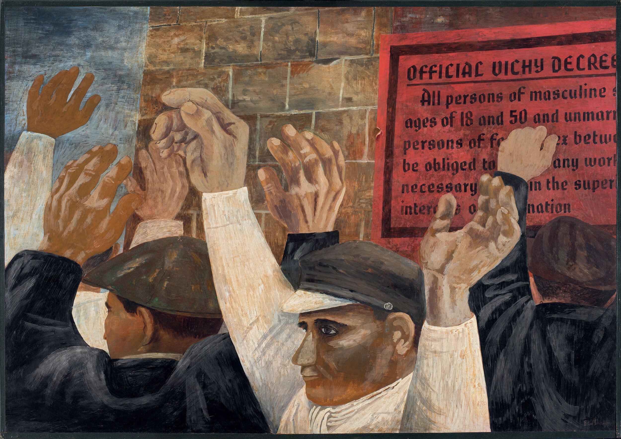
Shahn's illustrations were somehow modest in technique but loaded with meaningful content. If we contrast 'Give Back Our Sea' with the Shahn's painting 'Beatitudes' - the two coetaneous - it is possible to identify similarities. Smooth strokes, a central human figure, and strongly grief sentiment are present elements. In both examples, the simplicity of the shapes contrasts with the evoking content.
For the Japanese designer, Shahn's artwork became a primordial influence in his early career, at least in his first decade. In this period, he would concentrate his efforts on drawing concrete and tangible things. Later on, he will avoid the visual simplicity to follow a psychedelic path.

Beatitudes (1957)
Body of work
Aside from international influences, Awazu's vision was interested in traditional Japanese art forms. In the second half of the '60s, his work played with Japanese motifs, using vivid colours and abstract figures.
From this point, he would consolidate the styles he is usually known for, catapulting his persona to the top echelon of the graphic design world.


In 1964, Awazu designed the poster for the 4th International Biennial Exhibition of Prints in Tokyo. This edition centred on the work of an Ukiyo-e artist called Hiroshige Utagawa (1797-1858).
Ukiyo-e is a form of Japanese art popularized in the Edo Period; it is famous for its mass-produced wood prints and pop culture characterization. Usual themes were landscapes, kabuki actors, sumo wrestlers, ordinary folk, flora, and fauna.
As for Hiroshige Utagawa, the pieces he created were motivated by capturing nature, usually painting valleys, mountains, oceans, or other settings in Japan.

Awazu understood Utagawa's vision and ingeniously refreshed it into a modern style. In the poster for the '4th International Biennial Exhibition of Prints in Tokyo' poster, Hiroshige's classical mountain scenes reinterpreted as thin lines in a topographical map – a geographic resource to represent terrestrial relief.
These abstract lines play with our perspective. It also transmits the sensation of wood grain or water waving. The topographic lines will be a continual element in the designer's later work.

(1964)
One addition to this poster is the red hand stamped at the centre. This imprint is a common seal used by Japanese families. Even though this stamp plays a fundamental part in contrasting the design, it also reveals Utagawa's vision of the landscape.
Utagawa's ukiyo-e painting usually depicts scenic vistas of Japan, aiming the focus in the relation between nature and human life; the picturesque hills but also the town erected in them. Awazu played with this association and abstract it. The thin background lines as a representation of nature. The red hand as humans and their footprint on the environment.
Another example of finding new ways to represent Japanese motifs, is the 'New Spirit in Japan' (1984) poster, a collaboration between Kiyoshi Awazu and the kimono company Juraku. The piece was composed of two main elements: On the left, a variant of the already seen topographic pattern. This version uses curved lines, vivid gradients, and a multicoloured pallet to create a bolder result.

(1984)
On the right side, we see a sequence of illustrations. These correspond to Hanafuda drawings – an old Japanese card game. Awazu reversion of Hanafuda motifs uses an obscure pallet to refresh the visuals in this game. The result is atmospheric and hallucinogenic.
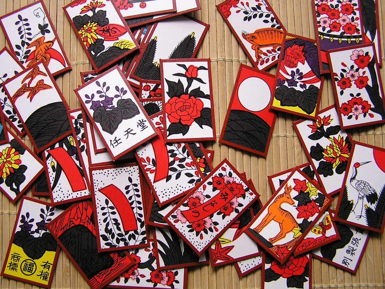
Hanafuda cards
Old and new are in constant conversation in Kiyoshi Awazu's bodywork. He had a precise eye to see traditional aesthetics through contemporary lenses. Colour and iconography became primordial tools to achieve his vision.
Some of his more surrealist works use destroyed Japanese symbols. A deconstructed version of the national imaginary – sometimes too deconstructed to be recognized by non-Japanese people. This tool enhanced the psychedelic visual style he is known.
As a consequence, Awazu left us with a vast catalogue of pieces that offers an involving experience.

(1979)

(1983)

(1973)

(1989)
Although Awazu had a candid passion for painting and graphic design, he experimented with diverse disciplines and formats. In his words: 'In all expressive fields, I resolve to remove not only the boundaries among forms of expression; I will also remove class, category, disparity, and the upward and downward that have appeared in art.'

(1977)
In 1970, the designer collaborated with the architect Minoru Takeyama for the Ninbankan building. Awazu designed the exterior look of the building. His proposal consisted of a colorful pattern as a facade.
For many, his intervention was remarkable. 'Back then nobody asked a graphic designer to paint the sides of a building' - said Takeyama. The painting was cheap; it only had to be restored every five years. Nowadays, the building is in a decrepit state. The original pattern replaced by another intervention.

Ninbankan Building
Another outstanding collaboration in Awazu's career was the film Double Suicide (心中天網島, Shinjū: Ten no Amijima). Directed by Masahiro Shinoda in 1969, Awazu worked as Art Director and designer of the advertising.


Double Suicide (1969)
Curiously, he made a brief apparency as himself in the LGTB cult-film The Parade of Roses. Although this is anyhow irrelevant, the movie is definitively worthwhile checking.
As far as today, the vast work produced by Kiyoshi Awazu astonishes the art community. His creations are an immersive visual experience, although hard to interpret. He used complex motifs to build a surrealist world and invite us to submerge on it.

(1975)

(1981)
But aside from this abstract experience, his pieces evoke emotions in us. There's a lot contained in these artworks to stay unmoved. They transmit joy, amusement, and playfulness, while other times, the author's grief for living the Post World War II Japan.

(1975)

Week-End – Japanese Ad by Awazu (1967)
Awazu kept creating until his death in 2009. His legacy continues to be relevant in our generation. He did not only revolutionize the graphic design culture in Japan, but he also foresaw a new path for social commitment. Kiyoshi Awazu reminds us that change isn't a threat to our traditions, but an opportunity to reawaken what seems outdated.

(1974)
ABOUT THE AUTHOR:
Lucas Moreno is an architecture student based in Santiago, Chile. He specializes in history, critic, and theory of Architecture.