SIMPLICITY & MINIMALISM - AN INTRODUCTION TO MUJI

Founded in the early ’80s, MUJI has built an image of simplicity, minimalism and ethical consciousness, heavily reliant on decisions from their design teams.
Launched at a time wherein sustainability was far from the top of both consumers and designers priority list, the Japanese retailer found its place-making high quality, affordable products with these morals in focus.
First MUJI Store in Aoyama
Today, MUJI have developed on these methodologies, delivering minimal brilliance and committing even more so to waste reduction policies. Consumer habits have facilitated their growth, with MUJI now established worldwide, and well known for the delivery of functional simplicity to it’s customer base.
“MUJI’s perspective is unique; in the MUJI concept, design intervenes in the making of things. This counters the rest of the world, which runs on the fuel of capital and appetite. Japan, looking upon the world from its detached location at the eastern end of Asia, has built an aesthetic that is infinitely attractive to human rationality, not within luxury and extravagance, but simplicity.”
Fukusuwa, an Industrial designer who is part of the MUJI family, created a piece in 1999 which has gained worldwide traction ever since with its seamless but playful method of interaction; the ‘Wall – Mounted CD player’, a piece where he really reflects on the coming together of space and the movement of how product functions are interpreted, blending the functionality of a bathroom light switch with the need to interact with a CD player in an innovative way. This flawless combination of functionality really encompasses what MUJI bring to the table – functional design with an aesthetic quality parallel to none. A real testament to the quality of the brand and the designers they believe in.
Fukusuwa’s design process is to do away with the extraneous and maintain the simplest form possible; art director Kenya Hara has described the design philosophy as “emptiness” rather than minimalism, embodied by a matching chair/bed set from 2004. The duo have an identical angle of backrest, something that was emphasised in their corporate advertising campaign “What happens naturally”, that worked to highlight the similarity in these two designs.
Chair/Bed Set by Naoto Fukusawa [2004]
Naoto Fukusawa
The label sets itself apart from others, doing away with traditional branding and marketing of the name “MUJI”, instead promoting a set of values that transcend traditional branding norms. Taking pride in “practicing, rather than preaching”, the brand’s image is an organic representation of their work, rather than the product of a marketing team associating their name with appealing core values.
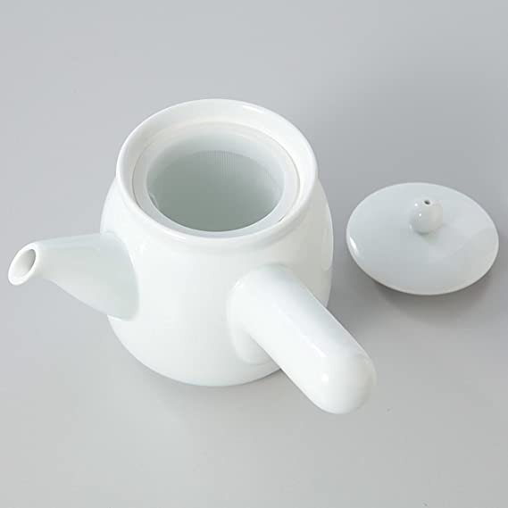
MUJI or Mujirushi Ryohin promotes a message of no brand quality goods, a philosophy that has remained from day one. On their products, there is no clear brand representation, logos, or branding; MUJI is ‘brandless’, and despite their ever-growing reach, the dedication to core philosophies and design sensibilities has remained constant.
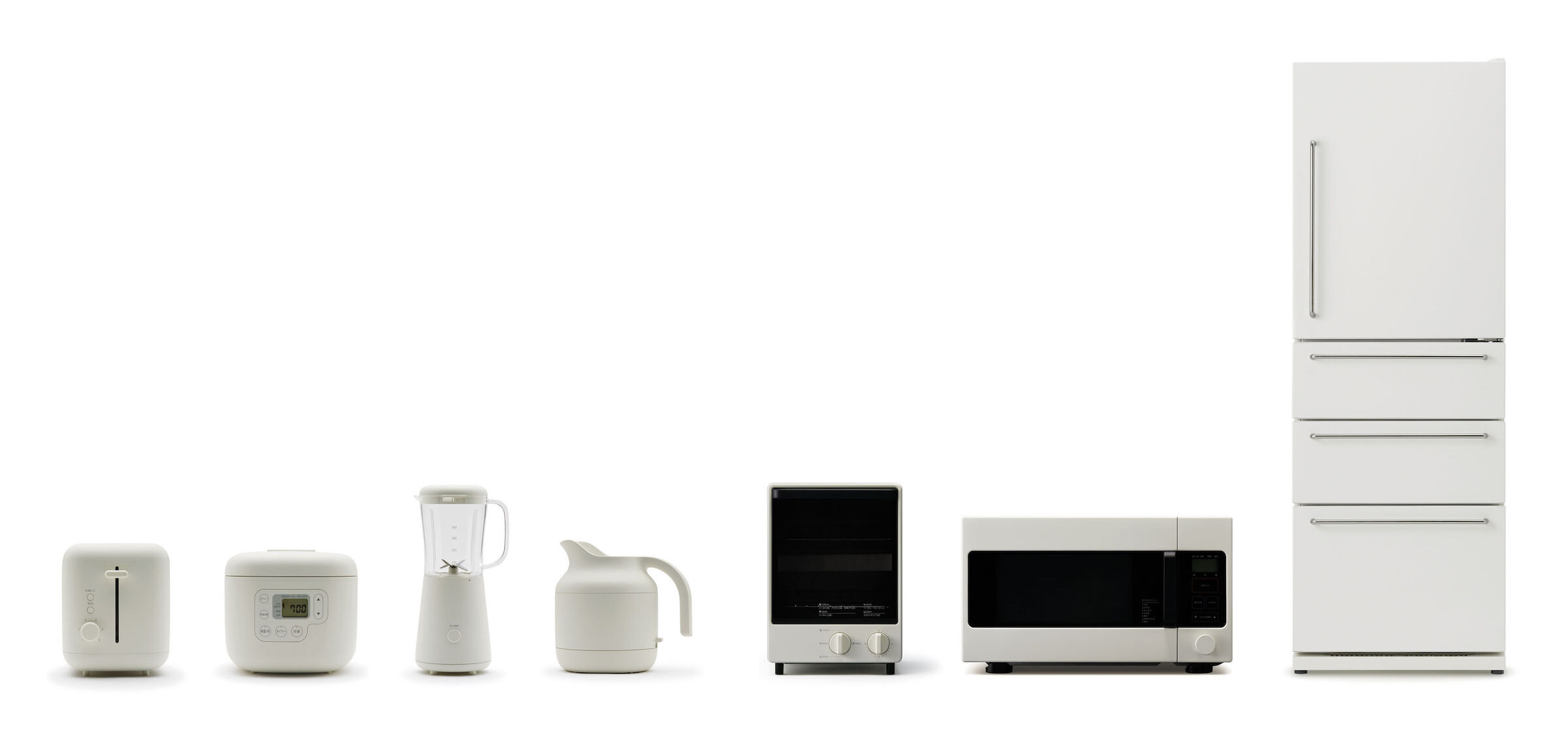
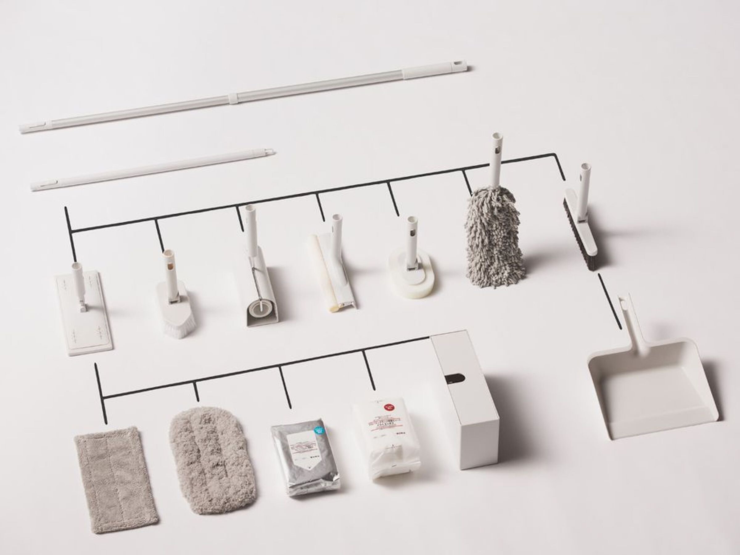
The products carry a sense of elegance with an attached simplicity; they fulfil a purpose, tick a box and that’s it. They don’t need to stand out, and they don’t aim to at all.
Rationalising the production process is a common idea today, but MUJI’s simplification has never resulted in cheapening. Instead, it has led to the manifestation of aesthetics.”
‘MUJI is enough’. Naoto Fukusawa spoke on this matter at the New York Fifth Avenue store, pushing this notion that MUJI products are designed and curated to be satisfactory, and in doing so, delivering the functionality desired. This is enforced by Kenya Hara’s principles of emptiness; in his book “Designing Design”, the company’s art director vigorously empowers MUJI’s philosophies, explaining that simplicity can reap outstanding results with the correct strategy.
Kenya Hara, founder of MUJI
Hara’s Book Designing Design
Meticulously selecting processes and materials to cater to their very specific price ranges, MUJI dedicates huge amounts of attention to minimising waste and manufacturing costs, in turn allowing for low prices relative to competitors at the same quality of product. The ‘no brand branding’ ideology comes full circle, and goes hand in hand with their sustainability-oriented morals, for very minimal packaging with low ecological impact.
MUJI Car 1000 in Collaboration with Nissan [2001]
About the Author:
Eddie is a student studying a Masters in Product Design based in Glasgow, Scotland. Besides being a student he is interested in fashion and sneaker culture as whole with relation to design. – With a keen interest in architecture and photography with those combination of interests work around each-other to inspire new ideas.


![Chair/Bed Set by Naoto Fukusawa [2004]](https://images.squarespace-cdn.com/content/v1/57825361440243db4a4b7830/1605090283117-YNL6Y6JDMVLU8PNUO3Q0/8Muji%2C+Mujidesign%2C+Muji+Japan%2C+Japanese+Design%2C+Tokyo%2C+Naoto+Fukasawa%2C+Kenya+Hara%2C+Chair+and+Bed+set%2C+Designing+Design%2C+CD+Player%2C+Sabukaru%2C+Onlinemagazine%2C+Sabukaru+Online+Magazine+Tokyo+-.jpg)


![MUJI Car 1000 in Collaboration with Nissan [2001]](https://images.squarespace-cdn.com/content/v1/57825361440243db4a4b7830/1605091685450-0U0M9QCQM6IPWTP4KIXS/17Muji%2C+Mujidesign%2C+Muji+Japan%2C+Japanese+Design%2C+Tokyo%2C+Naoto+Fukasawa%2C+Kenya+Hara%2C+Chair+and+Bed+set%2C+Designing+Design%2C+CD+Player%2C+Sabukaru%2C+Onlinemagazine%2C+Sabukaru+Online+Magazine+Tokyo+-.jpg)


