The Beauty Of Film Posters - Meet The Illustrator Tony Stella

A movie poster has to say it all. From the opening frame to the credits, movie posters must represent the entirety of a film in one single image.
Enticing, everlasting and beautiful; a good poster can stick in your head for years after the film has ended. Many posters have become iconic, and are the first things that come to mind when the film is discussed - an identifying image for the ages. But more recently, this image is often decided upon by the marketing team. The imagination that film posters once inspired, are being replaced by focus-group-tested mediocrity.

Meet Tony Stella, an illustrator who reimagines old movie posters into vivid, vigorous paintings. His paintings, ranging from watercolour to ink wash have, thanks to social media, turned his passion project into a career.
Stella is an illustrator dedicated to a labour of passion. In this article, you’ll learn about the inner workings of his brain and see his knowledge base. His expertise in design, and most importantly movie posters is something to behold. He spoke with Sabukaru on his work, inspirations and the film poster industry.
Dear Tony, can you please introduce you and your work to the Sabukaru network?
I am a traditional illustrator specializing in movie posters and cover art. In my work I want to pay homage to the films I love and to the people who made them. As so many of my generation of 80’s kids I obsessed about movies and was very lucky to experience them still in the big movie palaces but also had the advantage to see them multiple times at home with the introduction of VHS. In order to continue living in the fantasy of the film after it was over - I started to draw from them also decorating my video collection with covers to make them look like the store-bought versions. This is where I really started to connect to the artists like Renato Casaro - who painted a lot of these covers and posters.

You’ve truly carved out a niche for yourself in painted film poster art. As an artist, what about film posters attracted you so much to make it your career?
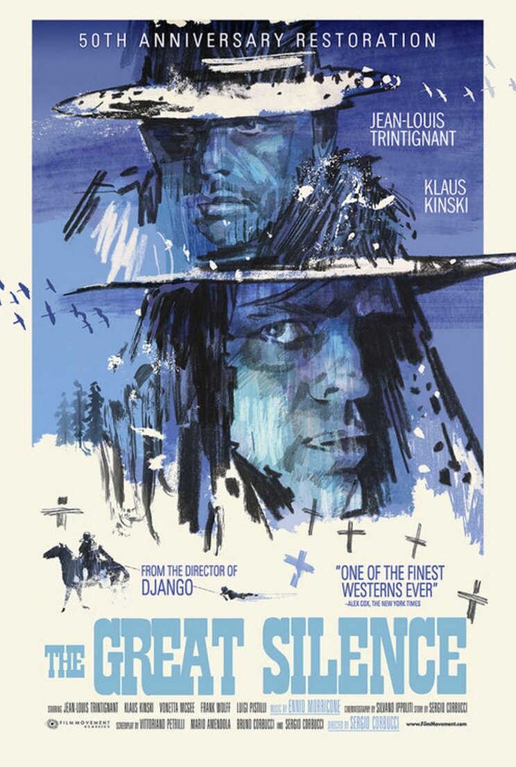
Like with most careers it is not something I could have ever planned but more a passion that I followed for decades without pay or reward. Most of my huge archive of over 600 hand-painted movie posters was not seen by the public before I started to post them online around 2013. After that it has really taken off in unexpected ways – the film twitter community and podcasts like “Wrongreel” really helped to spread the word and enabled me to work on dream projects like the 50th-anniversary poster for Sergio Corbucci’s “The Great Silence” or recently a new LP release of William Friedkin’s “Sorcerer”. It is now a career but foremost it is still an intense passion and love for movies that drives me.

In your opinion, what makes a film poster a good One?
That is impossible to say – like with film it could take all shapes - high or lowbrow. It could express and represent the film perfectly in tone; mood or portraits of the actors or offer a completely different take on it – even stand alone as a separate piece of art. I’ve been inspired by both and it is the variation that I love most. In the golden age of movie posters, every market employed their own artists who often painted several versions as well as character posters to advertise for the film – I still discover new ones that blow my mind after all these years.

Something that stands out in your posters is your varied use of typeface. Often you’ll paint the title of the film, but you also have used digital typeface and font. How do you decide what to use?
I used to paint them a lot more because I didn’t know how to use a computer and in the very beginning they were life-size with even all the credits written by hand. I still like to do it from time to time - when the movie calls for it but it has become a little over-used in the poster world. Also, I have a great partner in “Midnight Marauder” one of the best poster designers working today – we run a little company together called “Alphaville Design” – when he takes over the type design and layout it is on another level and always enhances my illustration.
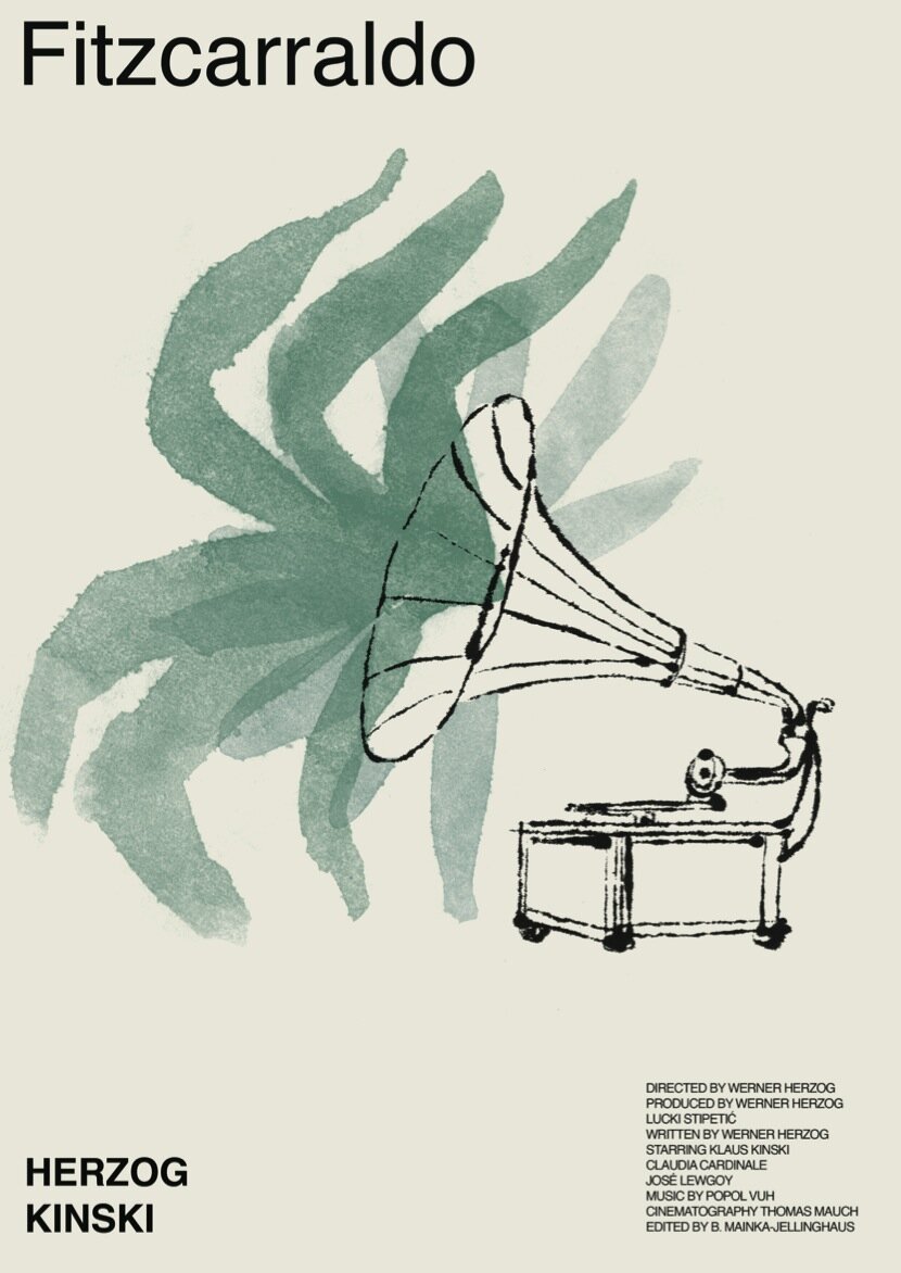
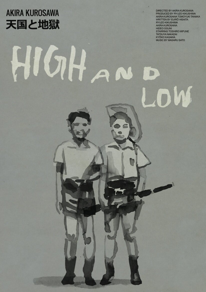
Your posters are often very different from pre-existing ones. Your posters for Fitzcarraldo don’t include the ship. Your poster for High and Low featuring only the two kids, rather than the main character. Do you actively try to do something different, or do you paint what you think best represents the film?
I like doing both. Often I am so in awe of the original poster that I have to find a completely different approach or I want to give a film more love and attention so I try to enhance it as best as I can. Throughout the years I’ve often painted many versions for each film – coming back to it years later makes you appreciate another aspect. To go wherever the mood takes me is one of the great joys of this work and being able to work in many different styles keeps it fresh and alive.
You’ve just watched a film, and are staring at a blank canvas, how do you start?
Again the triggers can come from all directions – a spark that speaks to me in the film or a lighting situation that is particularly beautiful – often I know the films very well before I start so I can go right in without much research. The tools I use change throughout the process of making the image – I jump around to see how I can find the best form. I never do any sketches – I am too impatient and impulsive.

Can you take us to the steps on how one of your posters comes to life?
After the drawing/painting is done I work on the computer always aware not to lose the haptic quality of the original work – I try not to do too much – I hate the flat, glossy digital look. Fitting in title, tagline, credits, logos and making them interact with the image is the final stage. With just a small adjustment you can push the entire thing in a different direction.
In your work, what do you want to capture most? Is it the characters? The feel of being in the world of the movie? The director's vision? What is most important to you?
I held on to the traditional ways of drawing and painting because that’s always what draws me in – I love when a poster can be part of a movie on its own terms. There are many great posters that are not using these methods but when it comes down to it, the surface and the hand-made touch is most important to me.

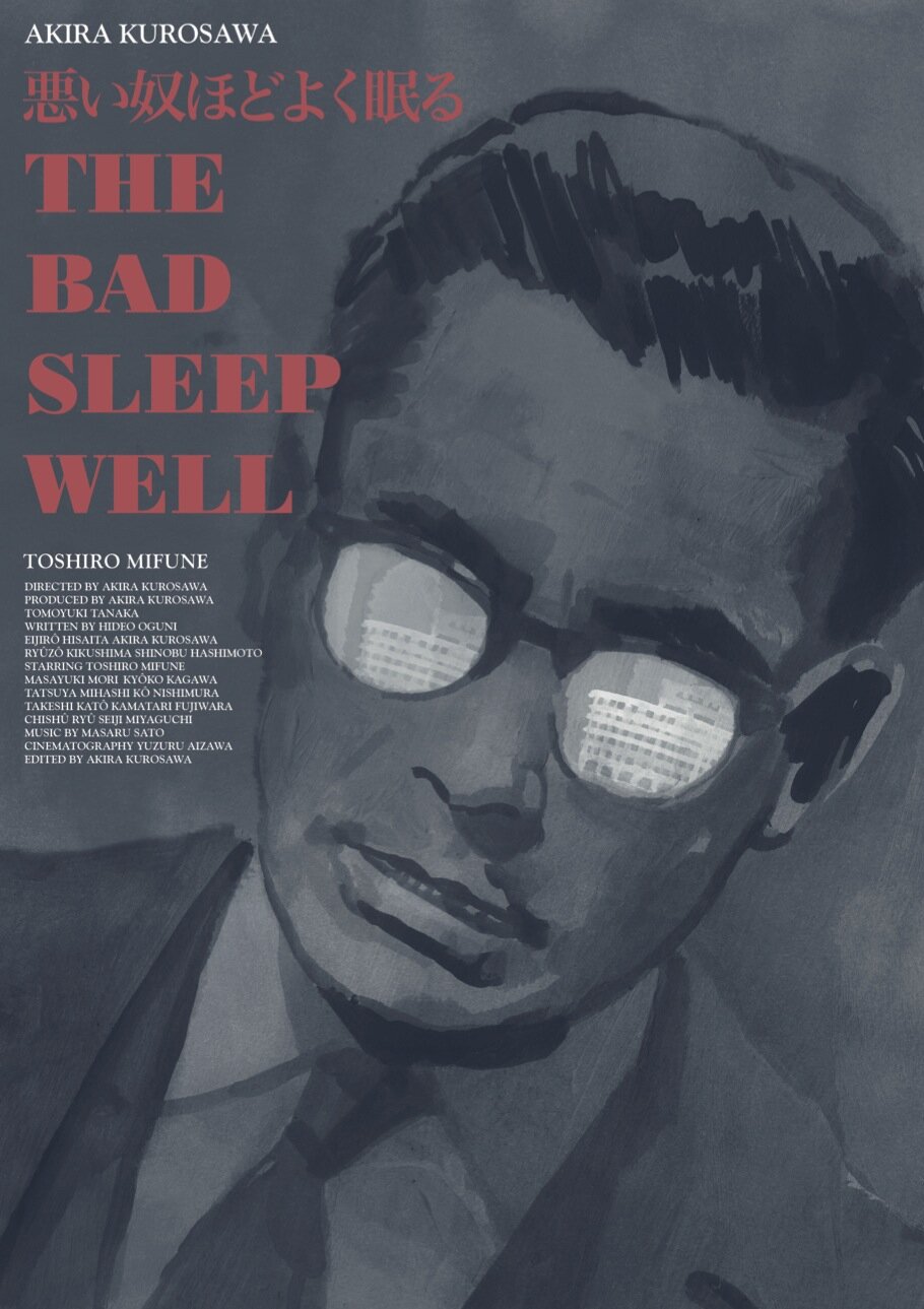
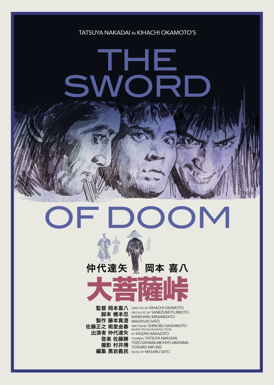
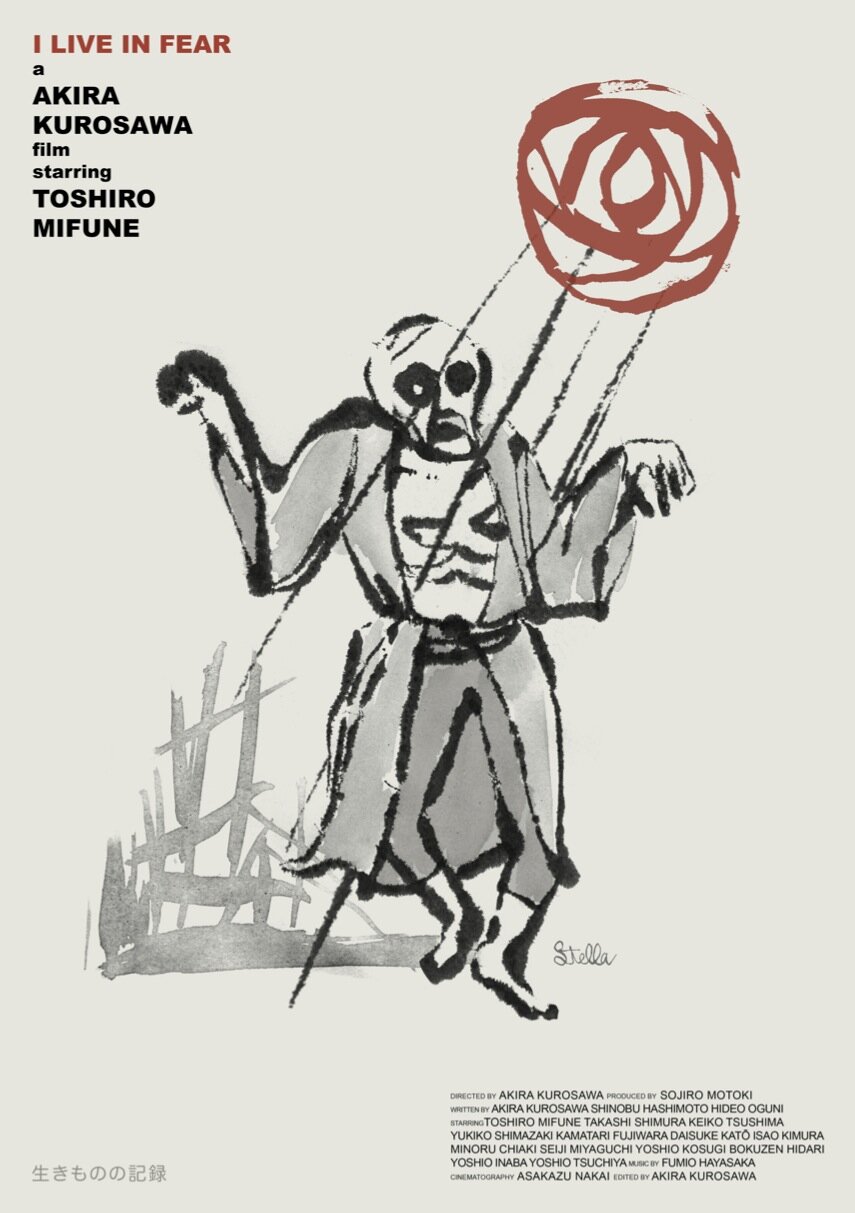
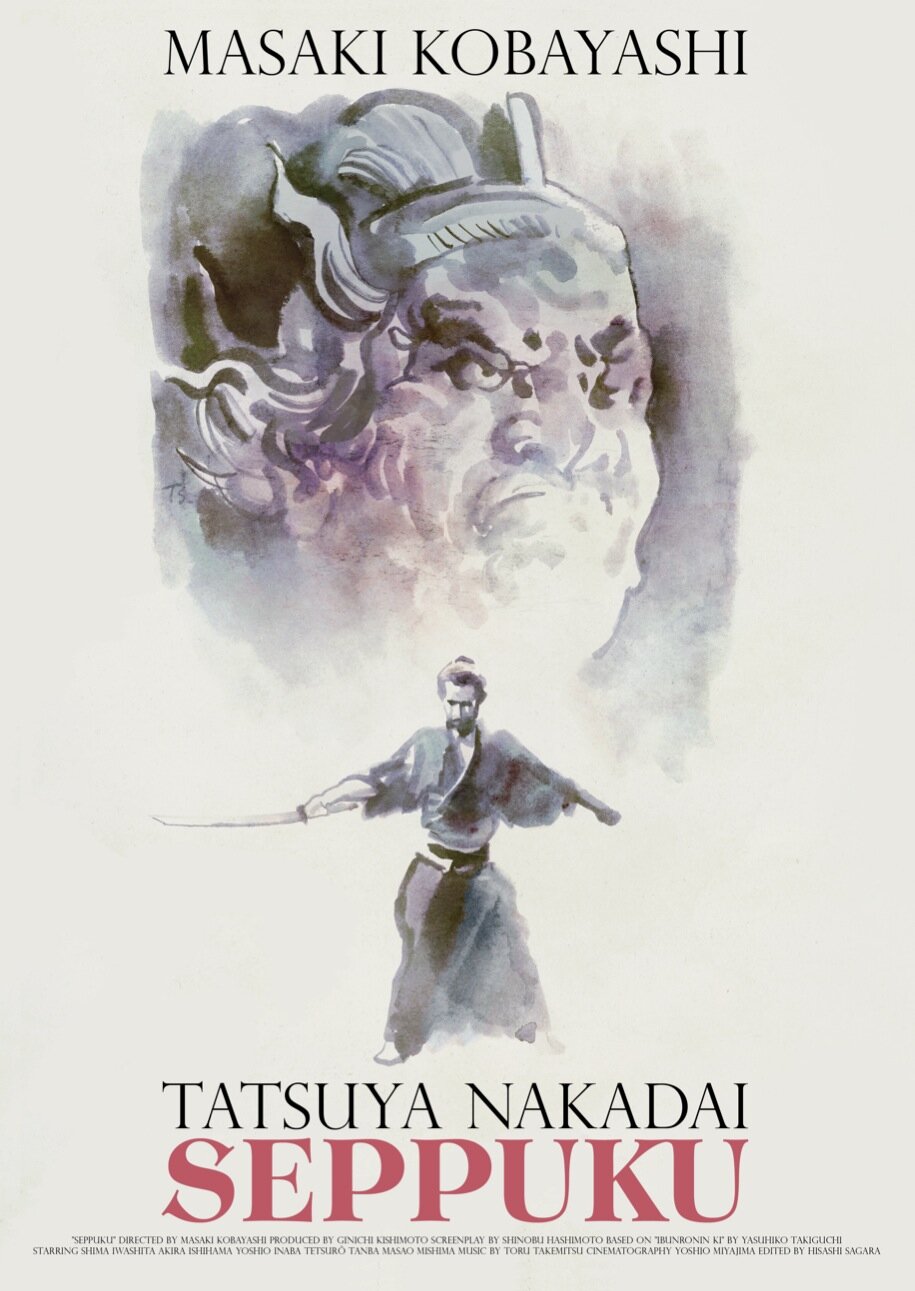
We have noticed a Japanese sensibility to a lot of your works. Would you say that you are inspired by the Japanese art of old? What are your inspirations?
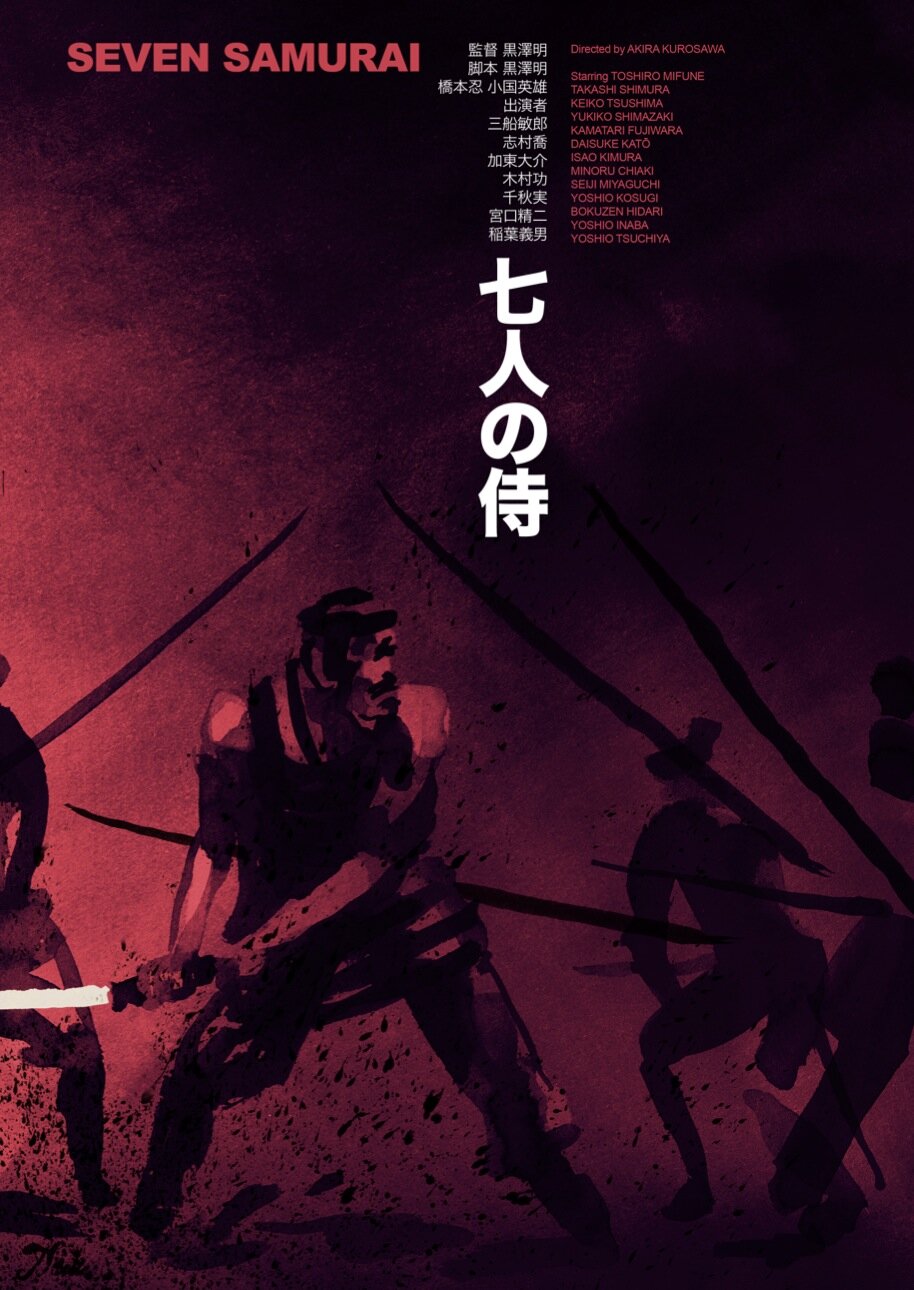
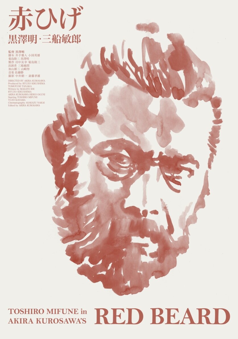
Early on my father exposed me to many cinema masters from all over the world but the film that has remained my favorite is Kurosawa’s Seven Samurai. At six years old that started a love affair with Japanese cinema and art that still influences me. I love to work fast and direct – Ink is perfect for that and also obviously linked to a Japanese tradition of image making and writing.

Film posters these days are often very derivative, and fall into a few categories. White background, with red text for romantic-comedies, blue and orange poster with the main characters staring menacingly for action films, etc. Do you think these trends should be broken? Do you think they have value?
While I see these trends go up and down - I get a lot of encouragement from the community of film-lovers who all appreciate beautiful posters - that also forces more and more companies and distributors to pay attention to make a poster that stands out. The online discussion really has helped to create awareness and punish lazy execution. That being said there is a lot of bad stuff out there and a lot of untrained eyes are still green-lighting too many digitally traced posters that try to give the impression of hand-made works. But overall the poster world is in a good place right now.
We won’t ask your favourite film because we know how hard that question can be, but instead, what do you like to see in a film?
That’s easy – “Seven Samurai” : )
The other question is harder… there are too many things… I like to see a crew of experts who are great at what they do, lone wolves, powerful villains with eccentric henchmen, dark inky shadows in cinematography, deep focus, epic scale, Lino Ventura, Sean Connery, Tatsuya Nakadai…
We hear you are working on a project dedicated to Japanese film. Can you please tell us more about this?
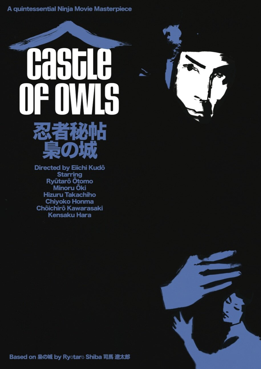
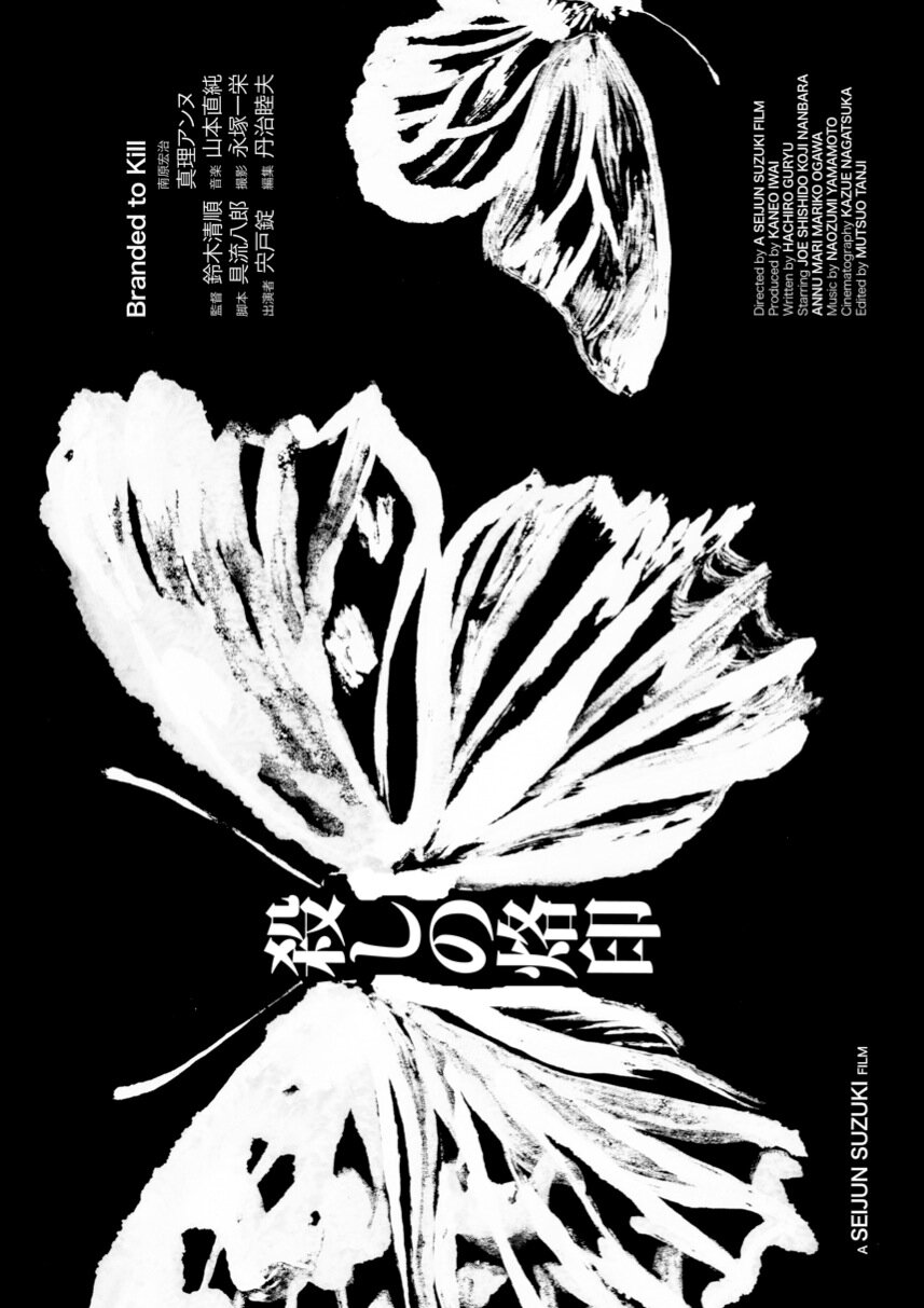
A long dream of mine has been to make a book that collects all the posters that I have made over the past 20 years – that has grown to be an almost impossible task and overwhelmed me every time I have started. Now I have found a very patient independent publisher that has committed to a small edition of a book to get the ball rolling. We thought I would be great and quite unique to concentrate on my Japanese posters. There are over 200 with many sketches and drawings to go alongside them. While this project has also been held up several times due to my crazy schedule I hope we can realize it in 2020. I would love to present it in Japan and make a small poster exhibition.
Thank you a lot for your time

About the author:
Living in Adelaide, Australia, Jack Duxbury is an expert in Romanian, Iranian, and Czechoslovak New Wave cinema. In his spare time, he writes and directs short films and advertisements. He enjoys film theory and the philosophy of cinema.


