THE INSANE HISTORY OF POLISH MOVIE POSTERS

You’ve probably noticed that nowadays nearly all movie posters look the same and every genre seems to have its own visual stylistic rules.
Contrasting blue and orange color blocks already suggest that we are about to watch an action movie. A dazzling yellow background stands for quirky indie productions. Of course there are countless other examples like the close up on a terrified eye for horror movies, a suspenseful shot of the protagonist from behind for superhero movies or the newest cliché a close up on a character’s face with lots of spaced out clean typography.
The Godfather Part 2 (1976) by Andrzej Klimowski
ROCKY (1978) by Edward Lutczyn
You get the jist of it, once production companies find a successful marketing recipe they’ll stick to it as long as it sells tickets. But for a few decades a movement in a communist country had been existing that pushed its individual style to a new extreme, in ways that even for today's standards seem absolutely crazy and radical: Welcome to the insane history of Polish movie posters.
Back to the Future (1986) by Mieczyslaw Wasilewski
You might have heard of great western poster illustrators like Bob Peak, John Alvin, Richard Amsel or Drew Struzan. Maybe you’re even familiar with Noriyoshi Ohrai, as a cultured japanophile. Granted, everyone of them is a legend in his own right but while these artists created incredibly detailed drawings with a heavy commercial appeal, the art of polish movie posters is an entirely different beast with a long history deeply rooted in the country's past.
Seven Samurai (1987) by Andrzej Pągowski
Star Wars - Return of the Jedi (1984) by Witold Dybowski
Without getting into too many details about who went to war with whom in the last couple of hundred years, just know that Poland or rather the Polish people were under constant attack from outside forces. At one point the country was even erased from the map for a substantial amount of time and its territory was split between Prussia, Austria and Russia. These threatening circumstances shaped a mentality of resistance which is deeply ingrained into the Polish collective mind. But despite all these existential crises a significant artistic community was thriving with its epicenter in Krakow.
Rosemaries Baby (1984) by Wiesław Wałkuski
Weekend and Barnies (1990) by Jakub Erol
Some Like it Hot (1987) by Wiesław Wałkuski
Live and Die in L.A. (1986) by Jakub Erol
These painters were influenced by Jugendstil, Cubism, Modernism and architecture in general. Of course there are dozens of influential names to be mentioned, but Tadeusz Gronowski (1894 -1990) is the most important one. He can be single handedly credited for establishing the so-called school of Polish poster art. Thanks to his connections to the pioneering scene in Paris (where the modern poster was invented) and his innovative use of the newest tools available, he was able to create powerful images that left a long lasting impression. To this day Poles take great pride in this particular segment of their cultural heritage (besides Jazz, but that's another story). If you follow the current political events in the country, you will quickly notice that posters are still an important form of protest:
Examples of modern polish poster designs for the “STRAJK KOBIET” (Womens Protest) movement by Jarek Kubicki to protests against the plans of the ruling conservativ PIS party to restrict women's rights. The slogan “wyPISdalać” is a multi-layered stroke of genius because it’s a combination of the word “wypierdalać” (to fuck off) and the PIS name. The logo and layout is a reference to the “Solidarność” movement, which was crucial in Poland's peaceful revolutionary fight against the comunist rule in the 1980s. Small text in the upper left corner reads “This is war”. Get this and other artworks for free here.
But let's get back on track -- after WWII Poland saw one dictator being swapped for another and it was completely put under communist rule. Fine art was now basically censored by the stalinist regime. But luckily there was a surprising twist of events that created an amazing loophole. The state owned film industry, represented by the “Film Polski” (Polish Film) and “Centrala Wynajmu Filmow” - or in short CWF (Movie Rentals Central) hired artists to work on poster designs for movies, but they absolutely didn’t care what they would look like.
Apocalypse Now (1981) by Waldemar Swierzy

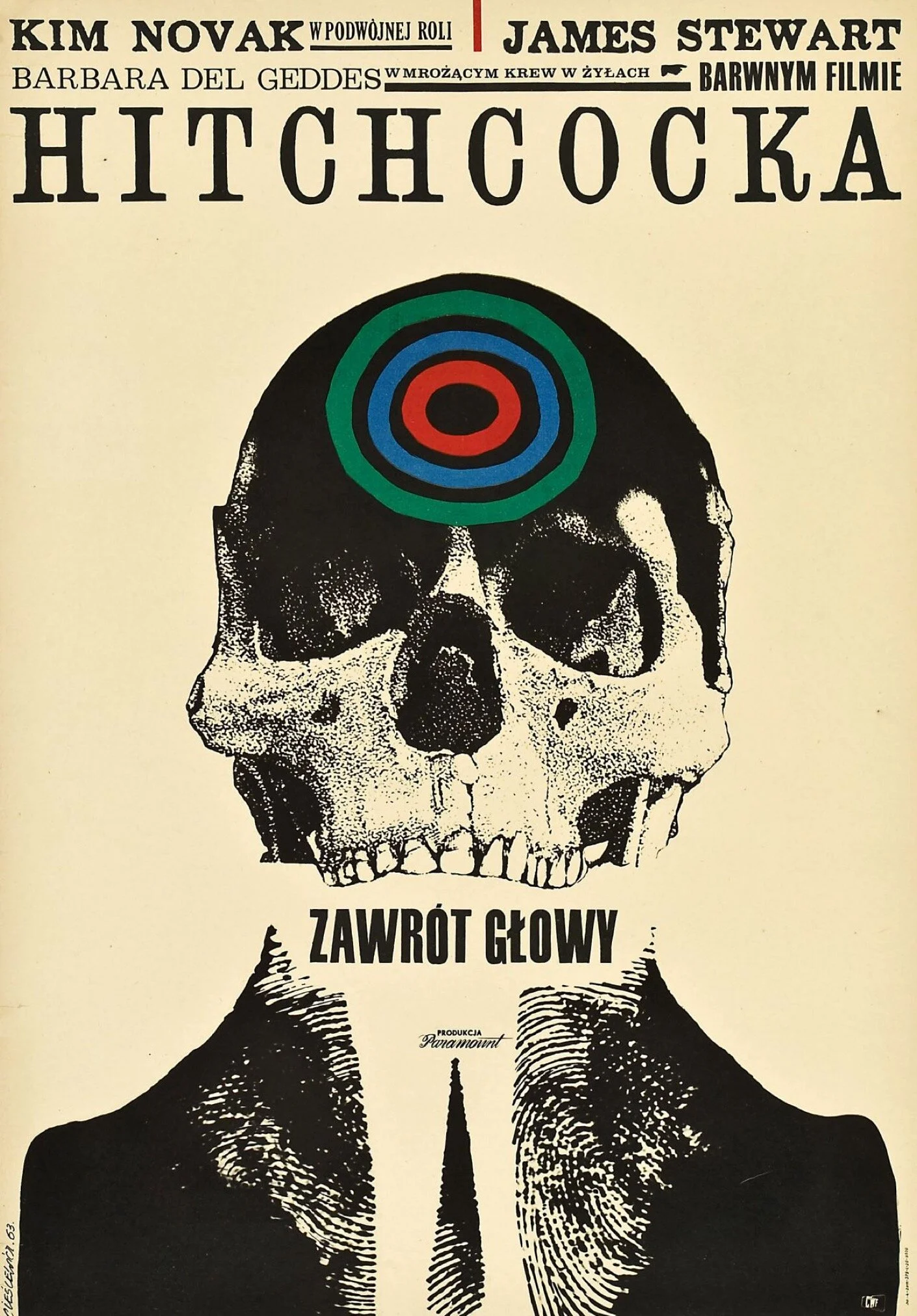
Strangers on a Train (1963) by Witold Janowski
This created a unique situation and a renaissance of Gronowski’s poster school in which creatives were granted nearly unlimited artistic freedom to do whatever they wanted, without any interference from the government or big Hollywood studios. By the 50’s movie poster design had de-facto become the only form of unregulated artistic expression and became a starting point for at least three generations of artists who switched from fine arts to graphic design. Without any commercial constraints the resulting images were absolutely wild interpretations and a far cry from the western originals. No headshots of the starring cast, no pictures of an impressive scenery and no fancy title design. Instead the artists got creative and found clever ways to represent the themes and movie titles in a symbolic and more abstract way using striking colors, eccentric visuals and witty metaphors.
Airplane! (1984) by Witold Dybowski
A Crazy Night (1967) by Jerzy Flisak

Working Girl (1988) by Andrzej Pągowski
Cabaret (1973) by Wiktor Gorka
This gave the artworks an almost universal quality, especially when you realize how many are charged with morbid and sexual overtones. Headlines, billing lists and other text elements were also often written by hand and directly incorporated into the design. Take the posters for OBCY better known as “Alien” and its sequel “Aliens” for example. These extraterrestrial depictions have absolutely nothing in common with anything represented in the movie, begging the question if the artists were even allowed to see the movies beforehand?
Also the alternative version of “Raiders of the Lost Arc” has an extremely bizarre feel to it and is more reminiscent of a design from a horror movie than an actual adventure flic.
Three different versions of the Raiders of the Lost Arc by Jakub Erol, Mirosław Łakomski and Grzegorz Marszałek all from 1983
Since the emerging pieces from that period were only limited by the creators’ imagination and didn’t follow any unified style or manifesto, they cannot be classified as its own artistic genre, but rather an exceptional phenomenon influenced by all kinds of different schools like Expressionism, Surrealism and Dada.
Solaris (1972) by Andrzej Bertrandt
Le salaire de la peur (1981) Andrzej Pągowski
The Birds (1965) Bronislaw Zelek
The 50s and 60s marked the golden era of Polish movie posters and of course the 70s and 80s had their fair share of awesome designs as well. Unfortunately and due to multiple reasons, mainly advancing computer technology and of course Poland becoming independent from the CCCP which ultimately dissolved in 1991, this way of producing promotional material became obsolete quickly.
The Big Lebowski (2010) by Andrzej Krajewski
Blue is the Warmest Color (2018) by Marcelina Amelia
Continuing from the 90s onward every movie poster looked the same as anywhere else and physical releases of movies from that period got an updated version closer to the original artwork. But due to popular demand special editions with alternative designs still get commissioned occasionally to keep the old tradition alive and collectors are willing to pay exorbitant prices for original- and reprints alike.
Taxi Driver (2018) by Jacek Staniszewski
Eyes Wide Shut (2007) by Leszek Żebrowski
Natural Born Killers (2018) by Jacek Staniszewski
Raging Bull (2010) by Leszek Żebrowski
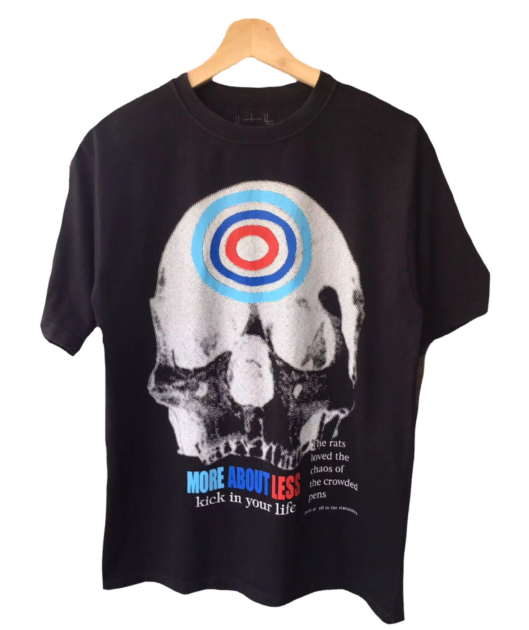
Thanks to emerging posts on social media and on blogs, the awareness of this brief yet impactful experimental design phase is spreading. So don’t be surprised if you see some Polish poster designs plastered on some of your favourite streetwear brands… Oh wait, that DID already happen:
Hiroshi Fujiwara used elements of the Vertigo poster for a Fragment Design x Good Enough collab, so did FUCKINGAWESOME

Gandhi (1984) by Maciej Woltman
Black Narcissus (1946) by Henryk Tomaszewski
Starman (1987) by Andrzej Pągowski
Christine (1985) by Jakub Erol
Fatal Attraction (1988) by Maciej Kalkus
Short Circuit 2 (1989) by Jakub Erol
JAWS 2 (1980) by Edward Lutczyn
Nosferatu (1980) by Zygmunt Zaradkiewicz
On a Silver Globe (1987) by Andrzej Pągowski
Heads and Tails (1974) by Waldemar Swierzy
I Like Bats (1987) by Jakub Erol
TERMINATOR (1984) by Jakub Erol
Howard the Duck (1987) by Jakub Erol
Romancing the Stone (1985) by Jakub Erol
Lubię nietoperze (1978) by Andrzej Klimowski
Godzilla Vs. Hedora (1972) by Zygmunt Bobrowski
Escape From New York (1983) by Wiesław Wałkuski
The Last Emperor (1989) by Waldemar Swierzy
RAN (1988) by Andrzej Pągowski
Heroin (1969) by Andrzej Krajewski
The Hourglass Sanatorium (1973) by Franciszek Starowieyski
Girl and Taxi Driver (1984) by Marek Ploza-Dolinski
About the author:
Julian Meinert is a hyperactive introvert who hates design by day but works for acclaimed brands at night. On his time off he plays Street Fighter and wishes that Masamune Shirow would finally get his shit together and draw a “normal” Manga, again.


