Tony Spackman: a Journey Through Movement and Shape

Louis Holsgrove’s latest editorial showcases the work of Tony Spackman, and gives us a vehicle to dissect the designer’s extensive portfolio.
Tony Spackman is a designer who produced various forward-thinking, tech-heavy ranges at Nike during the early 2000s. Two of these ranges, Code and Mobius, are considered by many to be years ahead of their time, and for that reason are highly sought-after and collectable. While Spackman’s influence - as we’re about to demonstrate - can be felt all throughout the fashionscape, there is little information about him online.


This scarcity of information has finally come to an end, as Louis Holsgrove, collector, seller and stylist spoke to Tony and key players in the industry in order to divulge into his career and design philosophies.
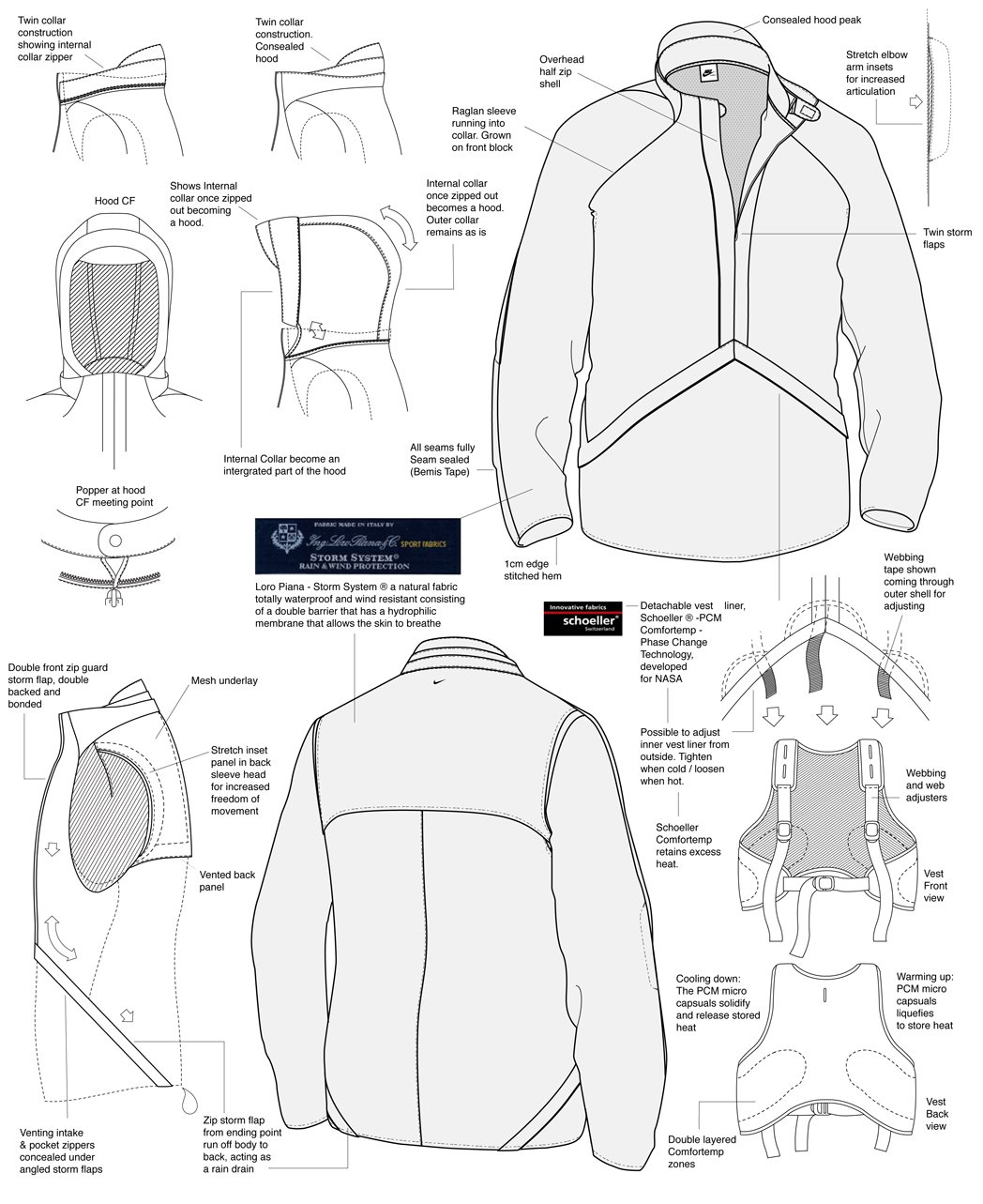
Unfortunately, when you currently google Tony’s name it’s monopolised by a very specific event: that time that Kanye [or, in effect, one of Kanye’s research team] plagiarised a design drawing that Spackman produced while working at Nike. The anatomical sketch, from Spackman’s ‘Living Apparel Fall ‘05’, was part of Spackman’s work at Nike React in 2004, and demonstrated one of Spackman’s core design questions: how does the body move, and can a garment harmonise with it?

NIKE / CODE / Autumn Winter 2003-04

The sketch in question deconstructed the body, broke down groups of muscles, joints and ‘critical areas’ with meticulous precision and imagined how layers of clothing could work with the body, prompting Spackman to handwrite notes like: “consider increasing lower spine/buttocks comfort through cooling?” and “does supporting critical muscle groups optimise performance/help prevent injury, or the opposite?”


Spackman’s work and sketches are well thought-out and considered, but given their age [the sketch is almost 20 years old], and Spackman’s relatively low-key persona [while he has 84k followers on Instagram, he hasn’t posted in four years] - prime pickings for a casual bit of design theft. But Spackman’s work is far more than those fastidious Nike React sketches, with a varied career that started at Duffer of St George [“I interned for a short period [...] alongside legends Marco Cairns, Eddie Prendergast, Barrie Sharpe and Kenneth Mackenzie”], includes a stint at Maharishi, and nine years at Nike, where he produced two highly collectable yet niche ranges: Code and Mobius. Following Nike, Spackman started his own project The NON, and then landed Design Director for Givenchy - a title held from 2013 until early 2022.

All of Spackman’s projects, despite sharing a single, continuous thread, are varied and diverse, flirting with hardcore functionality, and then moving to artistically-led and abstract design.
Spackman grew up outside Southend on Sea in Essex, UK. Speaking to Louis Holsgrove about his upbringing, he describes his parents as “young mods” that met in the late 60s. His early years were spent “hanging out on street and park corners, observing and absorbing the local scenes with [his] brother, cousins, and their crews,” where he felt like he belonged to a “diverse bunch of modern Brits living under Thatcher’s government - in poverty and mayhem.”


He describes his youth through the vehicles of subculture: “Punks, post-punk goths, suedeheads, new romantics, ska, metal heads, new wave synth pop-oriented kids and the early flow of b-boys, graff heads and anything hip-hop created a fresh melting pot, continually re-inventing itself and developing fusions of different fractions. It was a fascinating moment in time for a kid growing up, and I guess this gave me some sort of foundation for my ways of thinking and a very early excessive interest in physical appearance, what you wear, what you listen to, your style, and how you wear it.”

NIKE / MB1 / Autumn Winter 2003-04

These influences - specifically the aesthetics of graffiti, b-boy culture, skateboarding and hip-hop - shaped his final formative years. “I was obsessed with all this into and throughout the 90s and all the sounds that surrounded it. My graduate collection and its heavy use of hand-painted camo prints and military-inspired silhouettes landed me my first job at Maharishi.”
Fats Shariff worked at Maharishi when Spackman sent his portfolio over, and was sitting in for Hardy Blechman while he was on holiday. [Before Maharishi, Shariff worked at Bathing Ape’s UK line Very Ape and Goodenough UK, Hiroshi Fujiwara’s brand that influenced Nigo and a lot of the Ultra-Harajuku movement]. He recalls the moment he saw Spackman’s portfolio. “The sketches and styles captured MAHA perfectly, and each style looked like a natural progression on styles that we had on the market. It was the first time that I’d seen sketches with people of colour in a designer's book. It was great to see and to this day I’ve never forgotten and that made me love Tony more. I told Hardy: snap this boy up!”

MAHARISHI / OVERVIEW / 1998 - 2000

Spackman started working at Maharishi in 1997, after doing a few fashion illustrations for Blechman’s showroom in Paris. Eventually, he was made a permanent part of the small team, and worked with Maharishi until 2000, moving up the ladder to Senior Designer. He is largely responsible for a selection of super-technical apparel ranges. Think two-way zips, asymmetrical fastens, layered silhouettes, and baggy, oversized shapes that offered the possibility to taper and slim. “I was a streetwear kid so the technical side of designing garments was always of interest to me. I was - and am - obsessed with the details,” says Spackman to Louis.

MAHARISHI / OVERVIEW / 1998 - 2000
The editorials have a distinct late-90s vibe and perfectly capture the Maharishi of early. They’re adventurous and technical, and there’s a shoot where loose-fitting Snopants are worn for breakdancing - a homage to Spackman’s adolescent interests. “Through Spackman’s images,” explains Shariff, “you could see and feel the flow of the garments. You just knew how they would fit, and his proportions were amazing.”


MAHARISHI / OVERVIEW / 1998 - 2000

In January 2000, Spackman moved to Amsterdam to work for Nike. After producing various entry-level commercial products - tracksuits, t-shirts, hoodies, generic sportswear - he was called into a meeting to help workshop a new product.
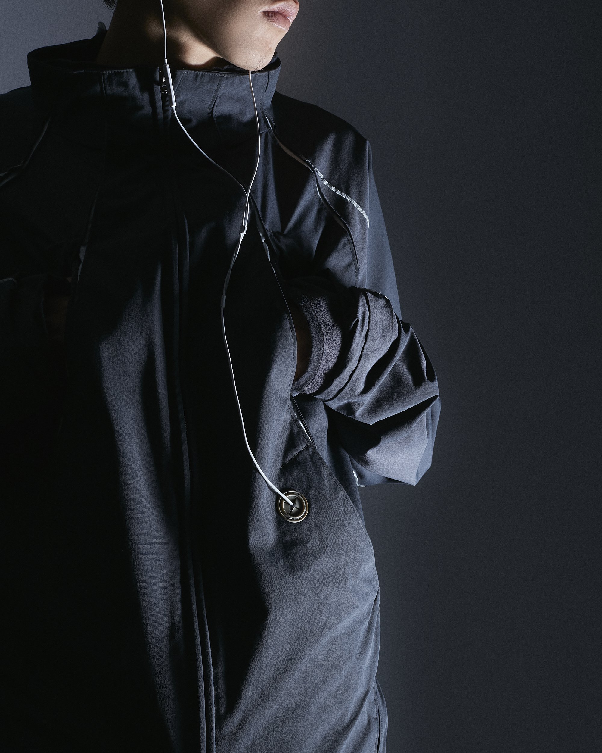
“I spent the whole week after work, right through the nights and the weekend, conceptualising new ideas of garment movement on the human form. I pushed myself to completely rethink how a garment should and can be constructed to allow for free movement, flexibility and comfort with as little restriction as possible. The result reconstructed everything from the inside out, with 3D protective shell units that would complement each other’s movement without interference. The result was Nike Code.”
NIKE / CODE / Autumn Winter 2003-04
Code Mastercraft Jacket Line Drawing
NIKE / CODE / Autumn Winter 2003-04
Code Pant Line Drawing
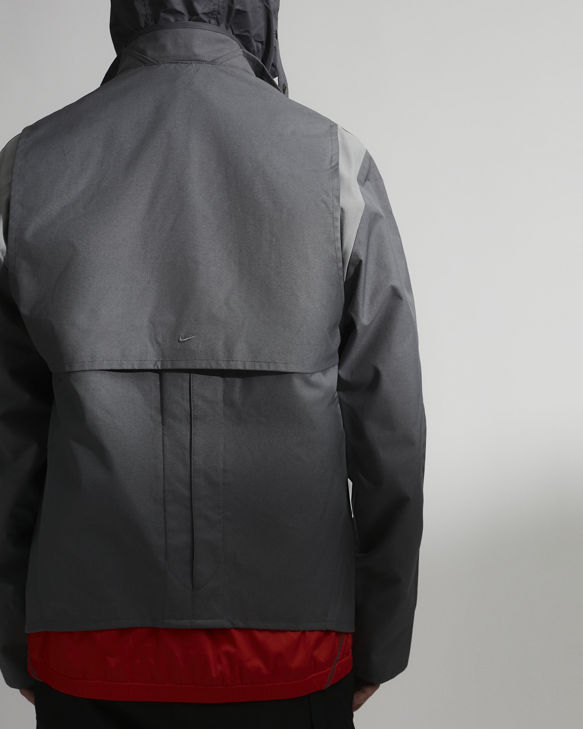
The Nike Code range was released in 2003 and was way ahead of its time. In an era full of swathes of Instagram mood pages, technical devotion and gorpcore jacket fetishisation, it would make perfect sense as a product in 2022. But way back in 2003, the line ran for only one year and wasn’t particularly commercially successful. The reason for this is two-fold and has as much to do with Tony’s vision as it does the internal workings of Nike, where the variety of sub-divisions are varied and energy and funding are split and pulled.

Louis Holsgrove Editorial Pics - Nike 01 Code Collection ‘Mastercraft’
Stewart Horner, whose career at Nike stretched 20 years, with positions such as Design Director at ACG from 2004 - 2008, Design Director at Nike Actionsports [a group created to harmonise the vision of ACG with Nike SB, snowboarding and others], and apparel roles at almost all of Nike’s sports divisions, laughs over the phone from his house in Portland: “Of all the designers I’ve worked with, Tony was - and still is - the most original and talented thinker.” Horner is full of praise for Spackman, dipping between design talk and nostalgic anecdotes, where his still slightly Yorkshire-tinged voice gathers traction and vigour when he recalls their work together.

Louis Holsgrove Editorial Pics - Nike 01 Code Collection ‘Mastercraft’

Horner refers to the 01 Code Project as “insane”, suggesting that it was leaps and bounds beyond anything ever created at Nike. But this was the problem. While Nike in the early 2000s had an excellent reputation within the footwear world, their apparel side was a different story. The public perception of Nike’s apparel was reflected in their marketing budget, which meant that while Spackman had the capacity to produce innovative clothing, the “bigger Nike engine” [as Horner describes it] didn’t support it enough. Ultimately, Nike “didn’t seem to be behind what Tony was trying to do.” Despite this, they gave him the resources to create Code 01, which was highly priced and difficult to make. “Tony used this pattern cutter that he’d known since college. I think Code demanded some of the most difficult pattern cutting I’ve ever seen,” says Horner. Spackman even created new technology for the release, working with YKK to produce an invisible, open-ended zip, which had never been introduced before that point.

Louis Holsgrove Editorial Pics - Nike 01 Code Collection ‘Rain Jacket’
Because of Code’s price point, its release was limited to what Nike refer to as Tier 0 Accounts. These are spaces that place their emphasis on highly designed products, and includes shops like Colette in Paris and Corso Como in Milan. Horner recalls that it wasn’t always retailers: “there was even a rail in Frozen Fountain Amsterdam, a high design, conceptual furniture store.” [Horner, who has since left the fashion world and is now an interior designer, remembers a time when both he and Spackman were simultaneously upgrading their Amsterdam apartments, swapping notes and referring builders to each other. “Tony had this crazy cantilevered bed with no legs attached to the wall. He loves all types of design.”]
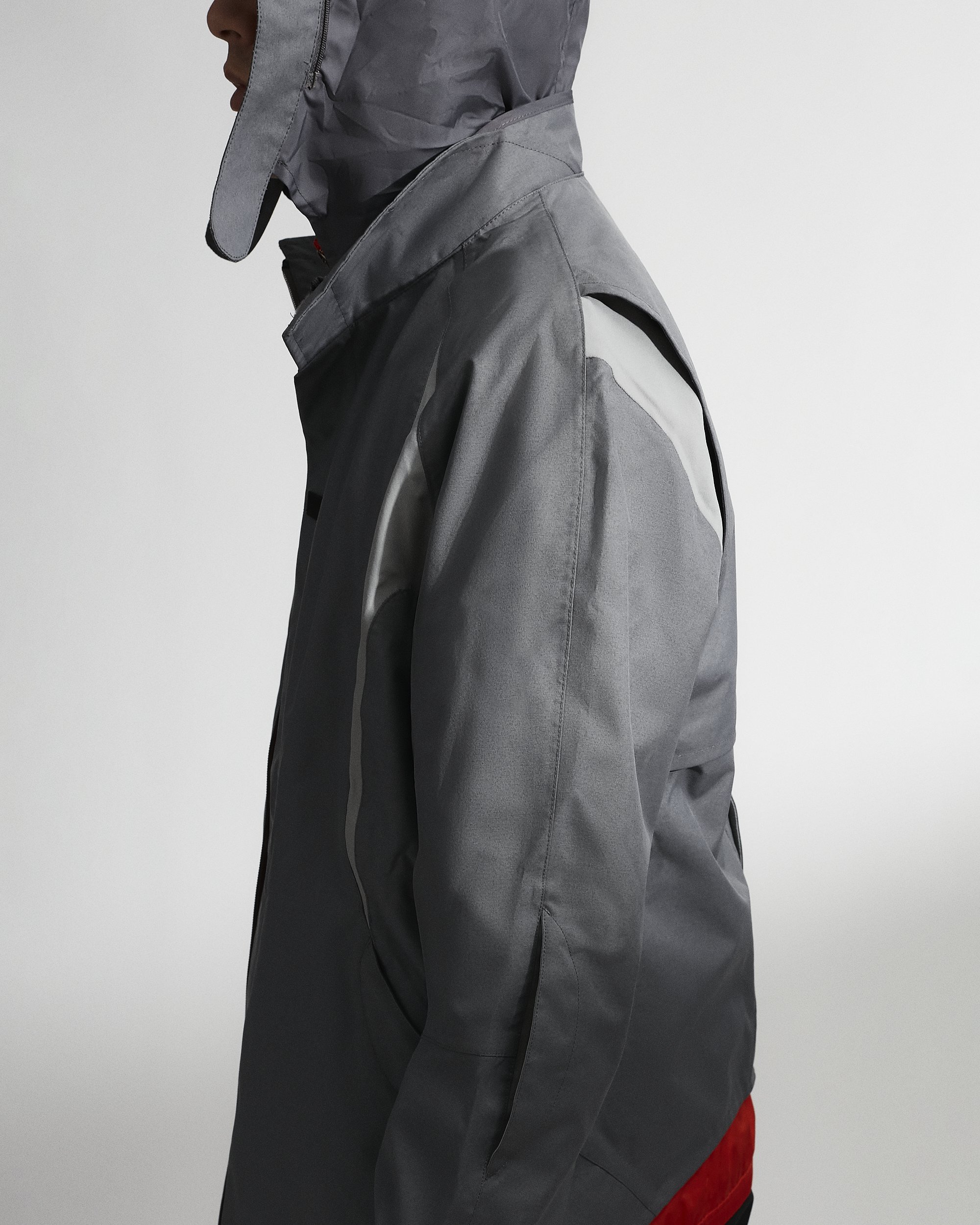
Louis Holsgrove Editorial Pics - Nike 01 Code Collection ‘Rain Jacket’
Code 01 launched into about ten spaces worldwide, accompanied by a launch party at Colette, where the legendary artist Futura hand drew on a few pieces for the window display. Drieke Leenknegt, the head of PR for Code’s release, explains that it was important for the collection to be debuted on the street level. “This collection stood for the cross between functionality and daily life. It - and Tony’s work in general - kickstarted the space of activewear as purposeful product, serving movement and the body. Tony expanded Nike’s DNA into this field.”

Louis Holsgrove Editorial Pics - Nike 01 Code Collection ‘Wet Jacket’
A year after Code’s release, Nike, with Spackman still at the helm, released a less expensive iteration called Mobius, built around the same principles as Code. In essence, Mobius used slightly cheaper materials, had a broader distribution and less complex patterns, but still captured the vibe and feel of Code 01. As Code’s obsession was with free movement, Mobius originally stood for mobility, and is often shortened to MB1.

Louis Holsgrove Editorial Pics - Nike 01 Code Collection ‘Wet Jacket’
Nike 01 Code Collection ‘Wet Jacket’ Line Drawing
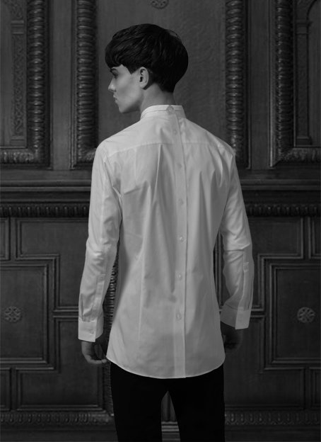
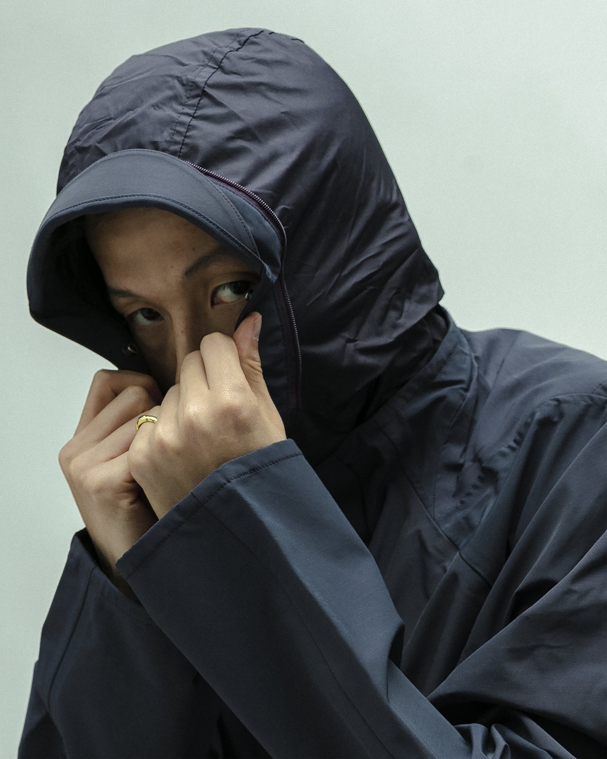
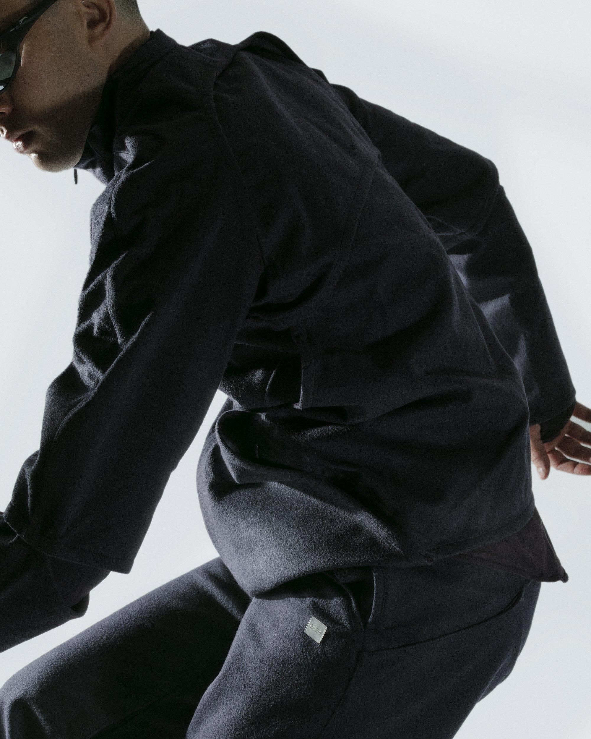
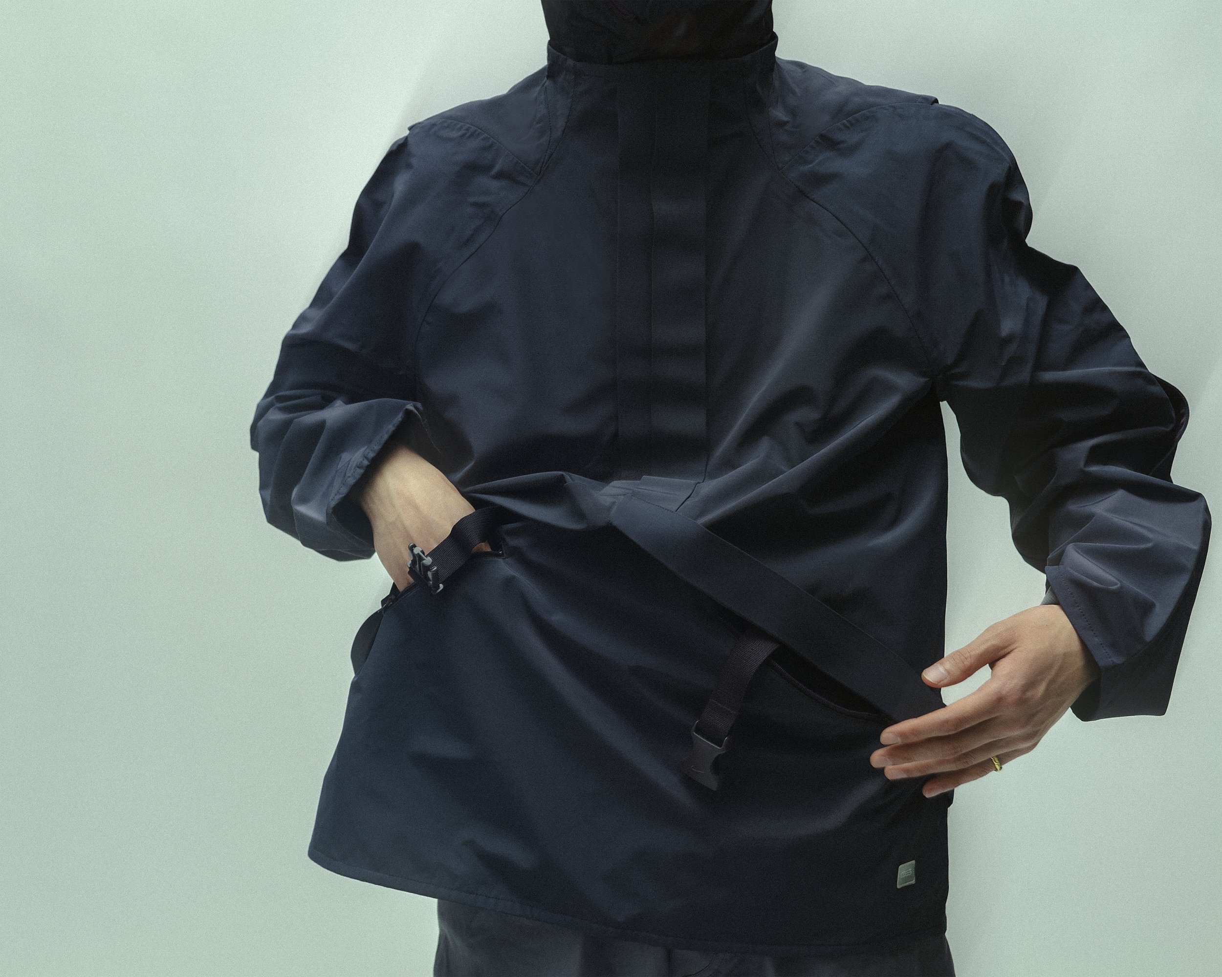
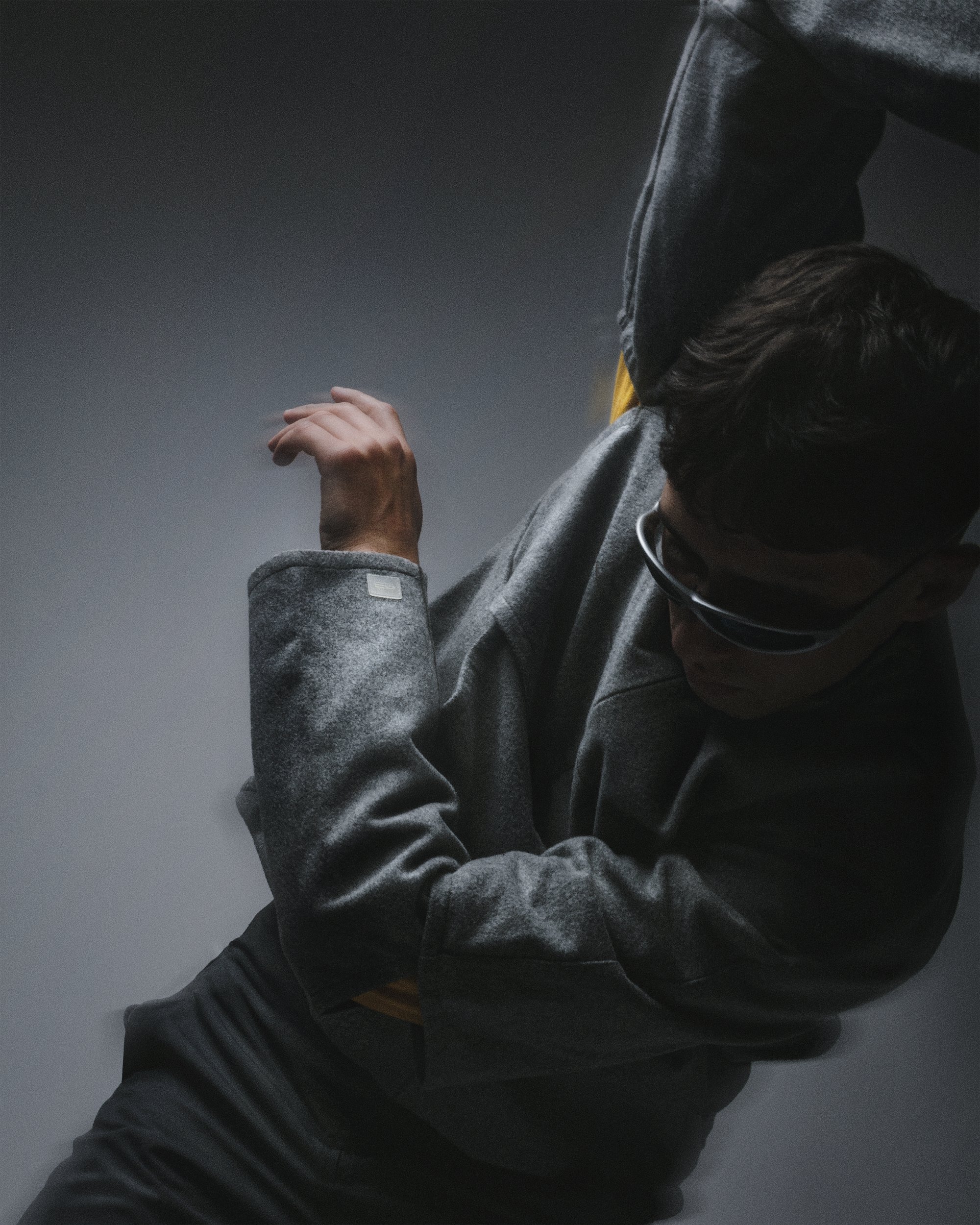
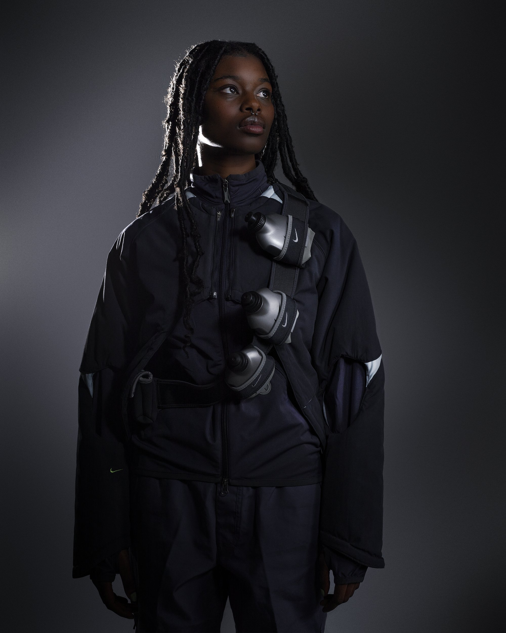
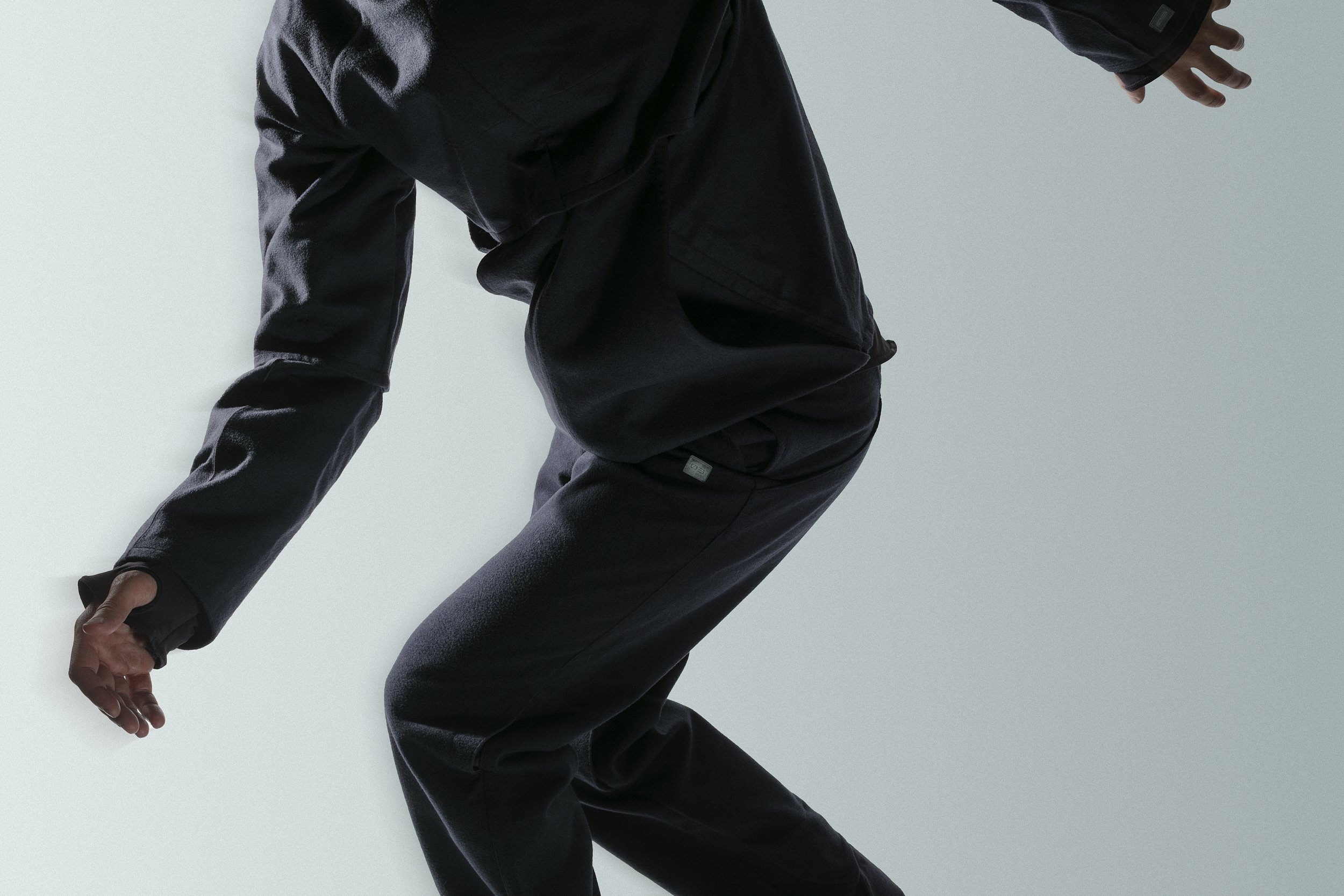
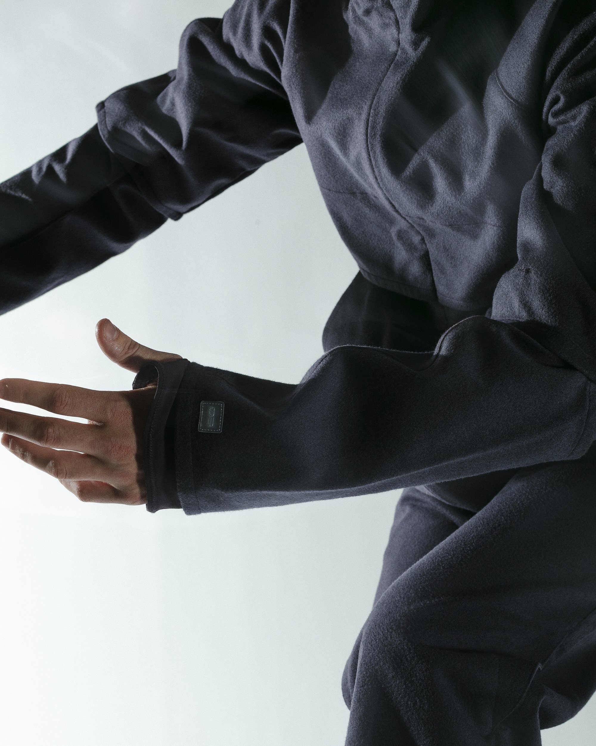
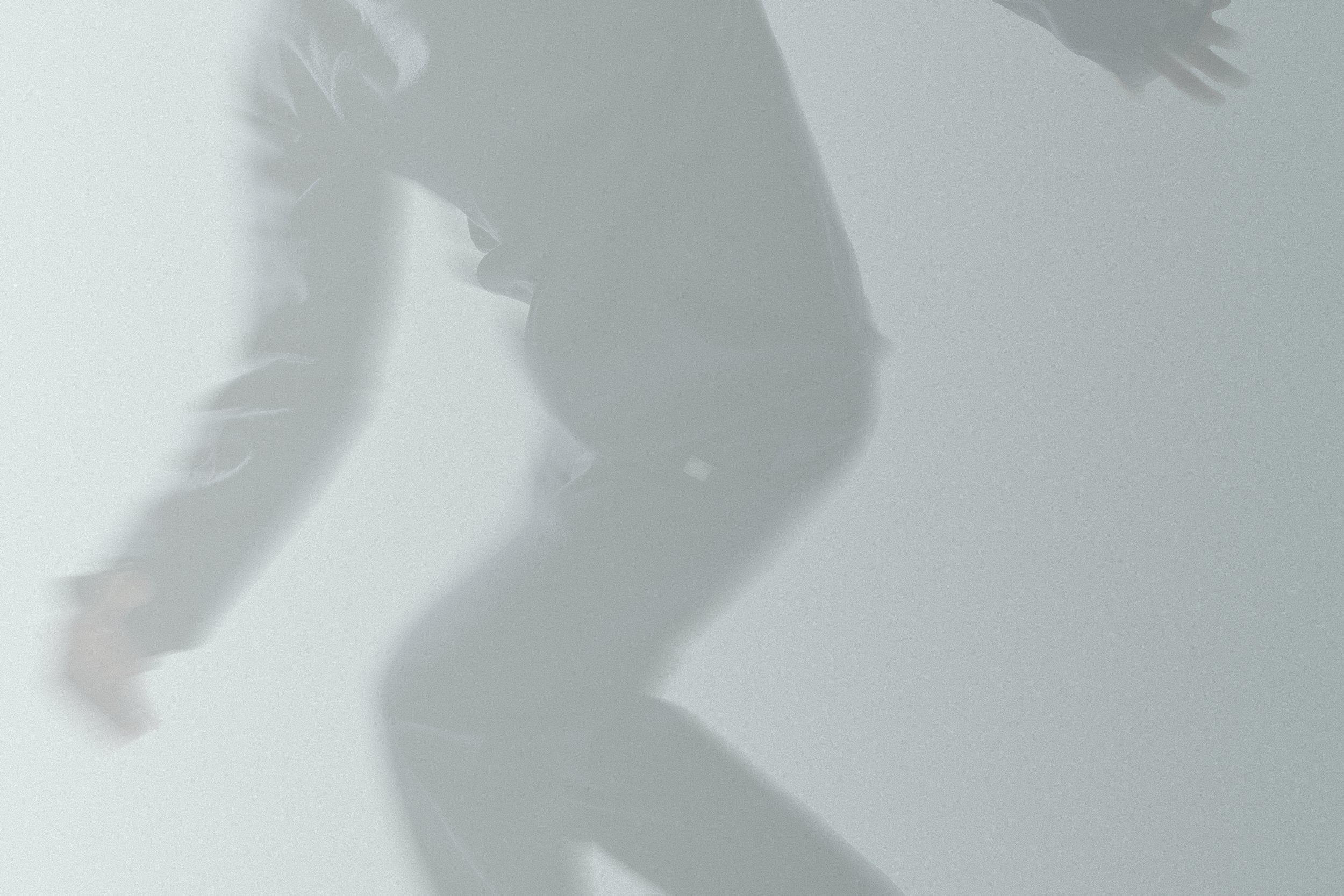
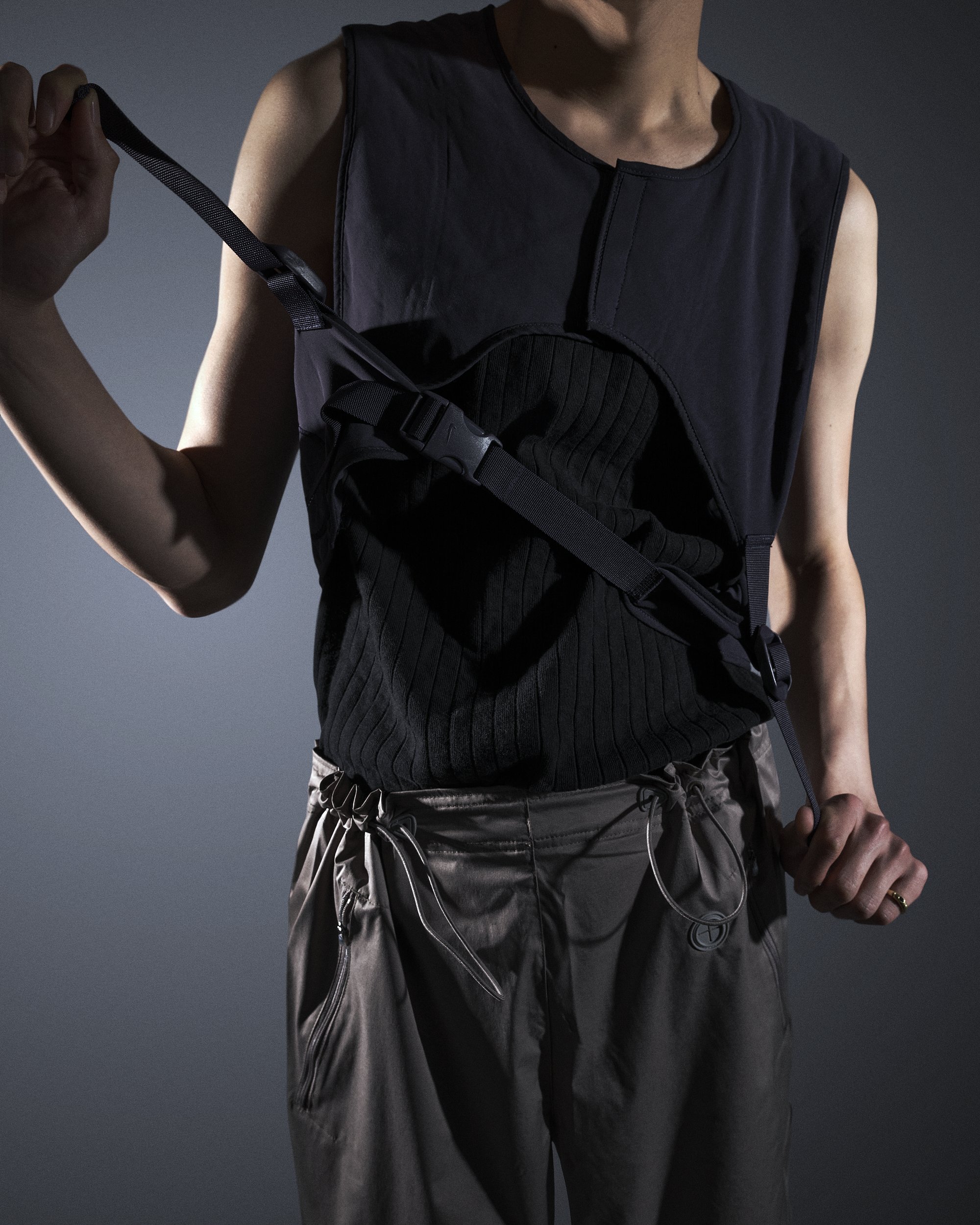
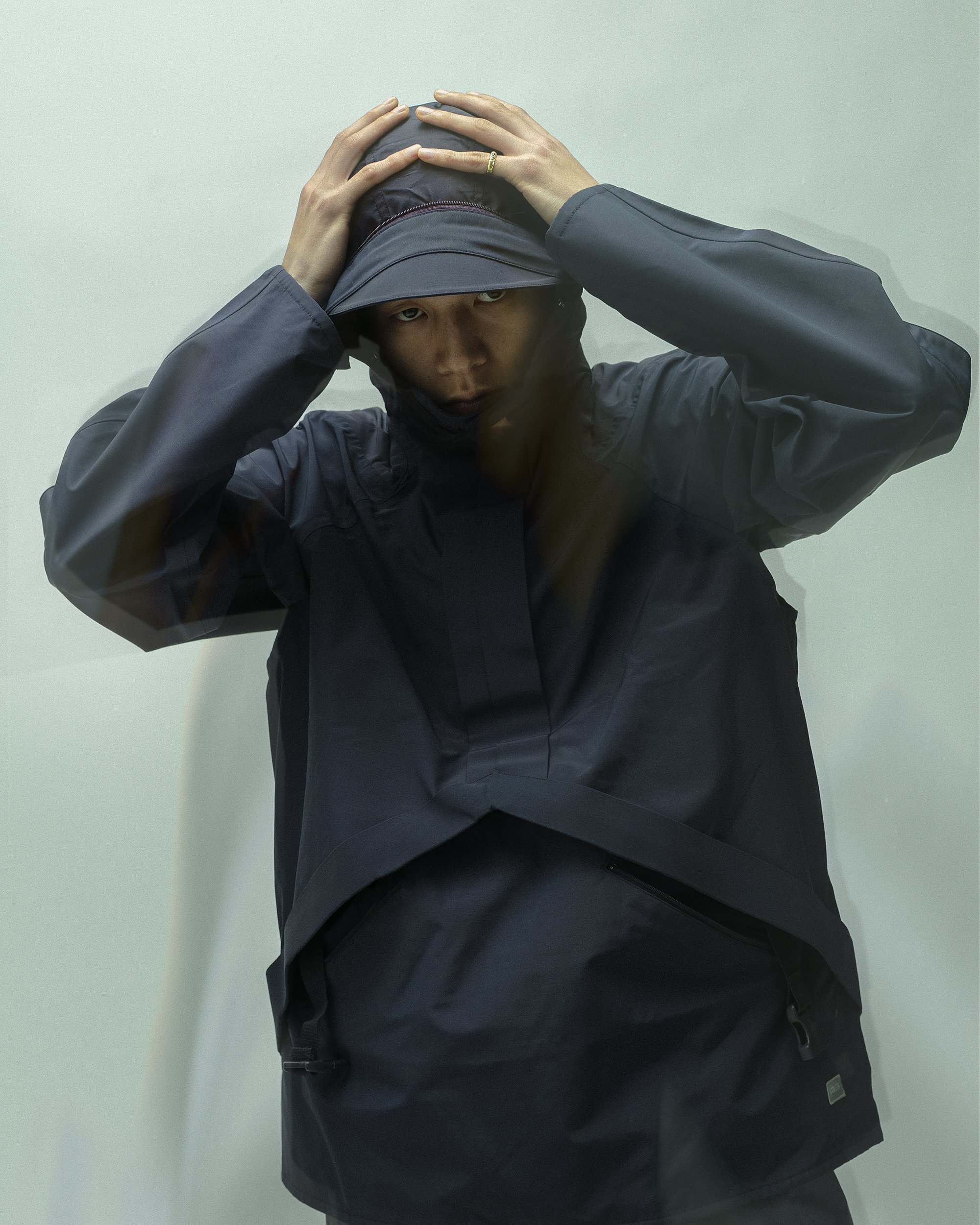
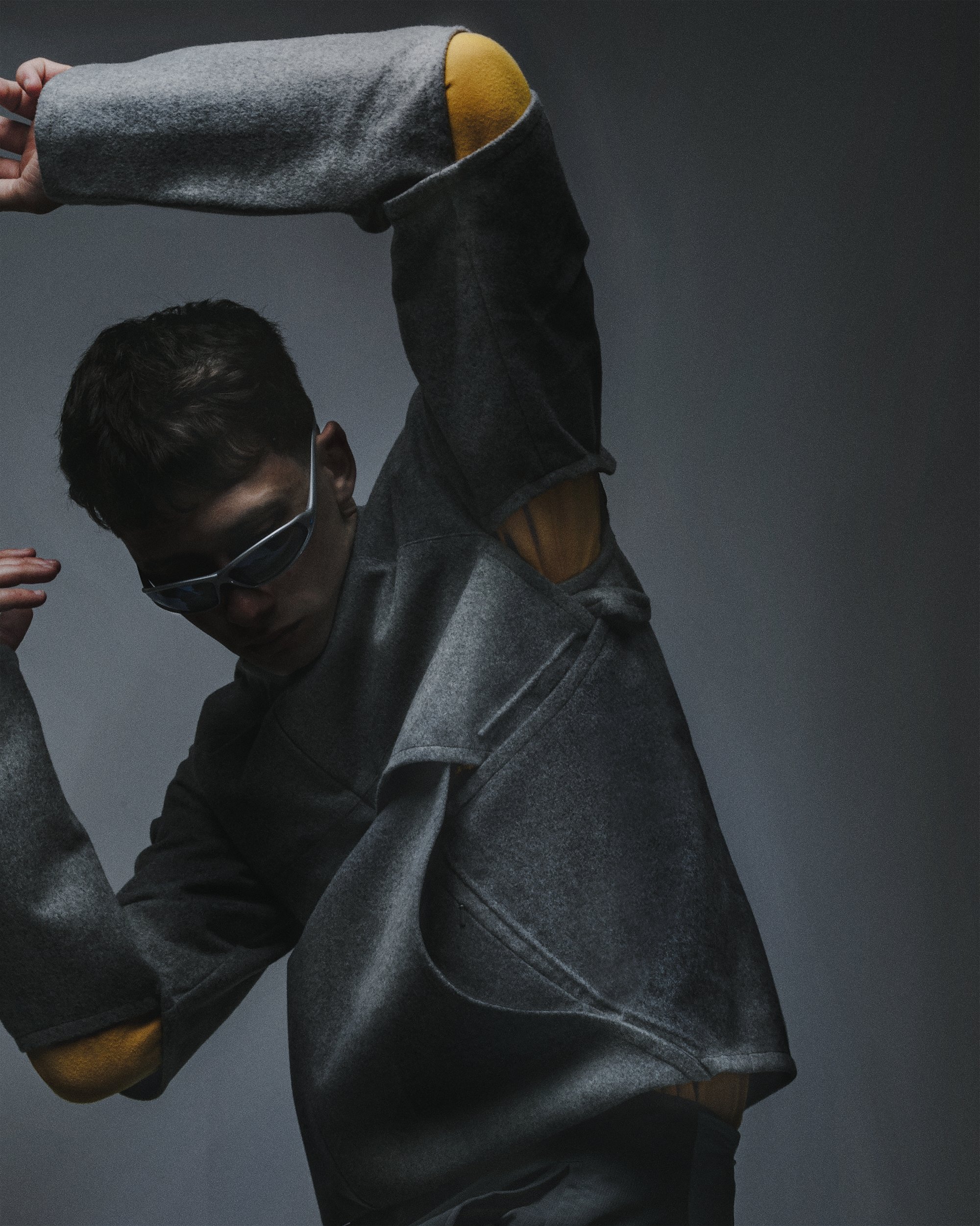
The editorial pictures dotted throughout are the latest work of Holsgrove, who has been collecting and identifying key pieces from both the Code and Mobius collections - many of which are now for sale. Comparing the two, Holsgrove argues that “Code might be less wearable - it’s more like design for design’s sake - whereas Mobius is tailored to more everyday use.” Aside from design elements, Code is set apart by small and square black tabs on key areas like the breast and sleeve, and the label includes the word ‘Nike’ spelt in morse code.

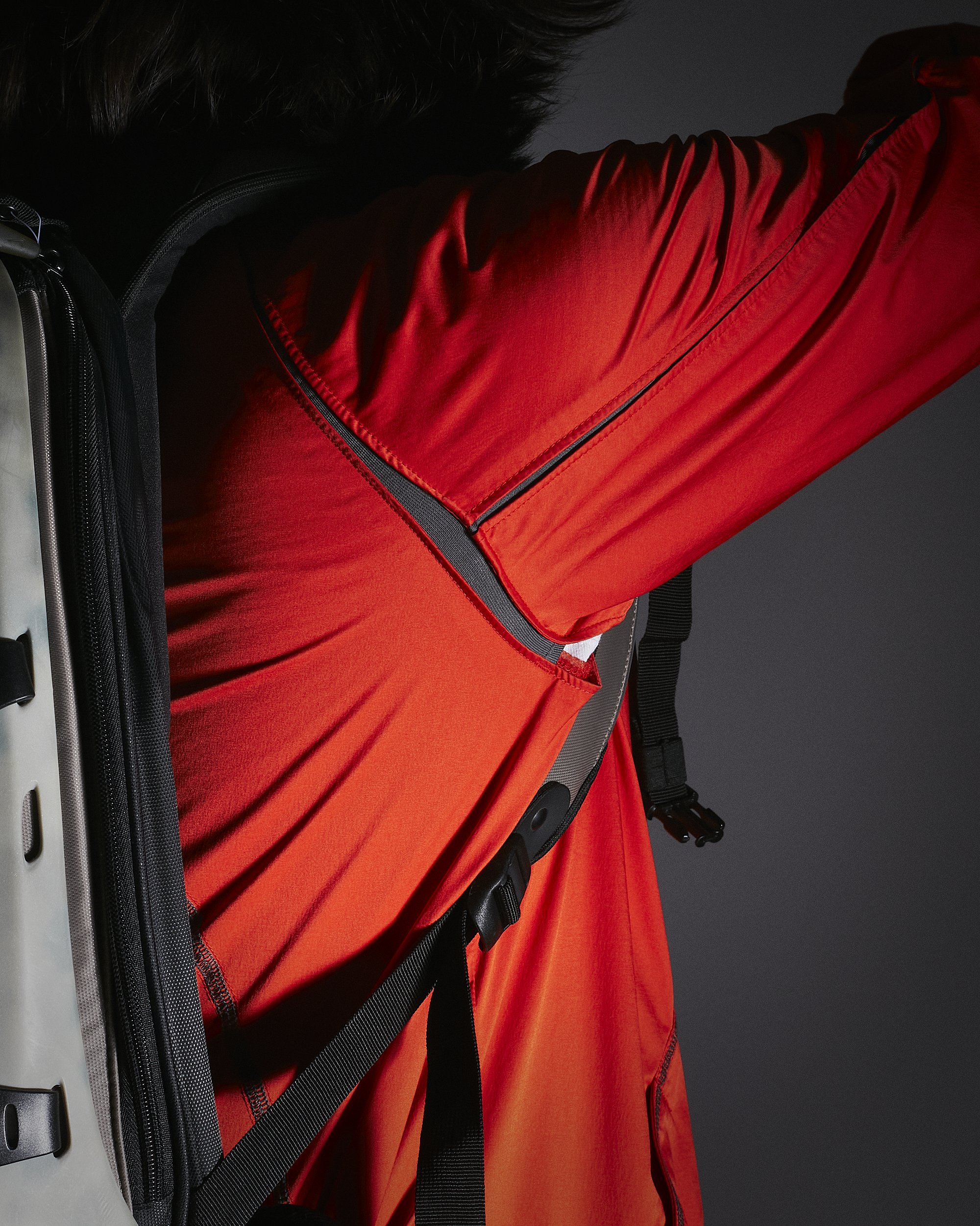
Holsgrove’s editorial captures the original essence of both Code and Mobius, using exaggerated movements to showcase how the items flex and stretch. The colours are monotone and set against a simple greyscale background, replicating the images of the original Code AW03/04 debut. At many of the item’s key intersections - armpit, elbows, back vents - flashes of colour appear, highlighting often invisible design touches.

Louis Holsgrove Editorial Pics - Nike MB1 ‘Mobius’

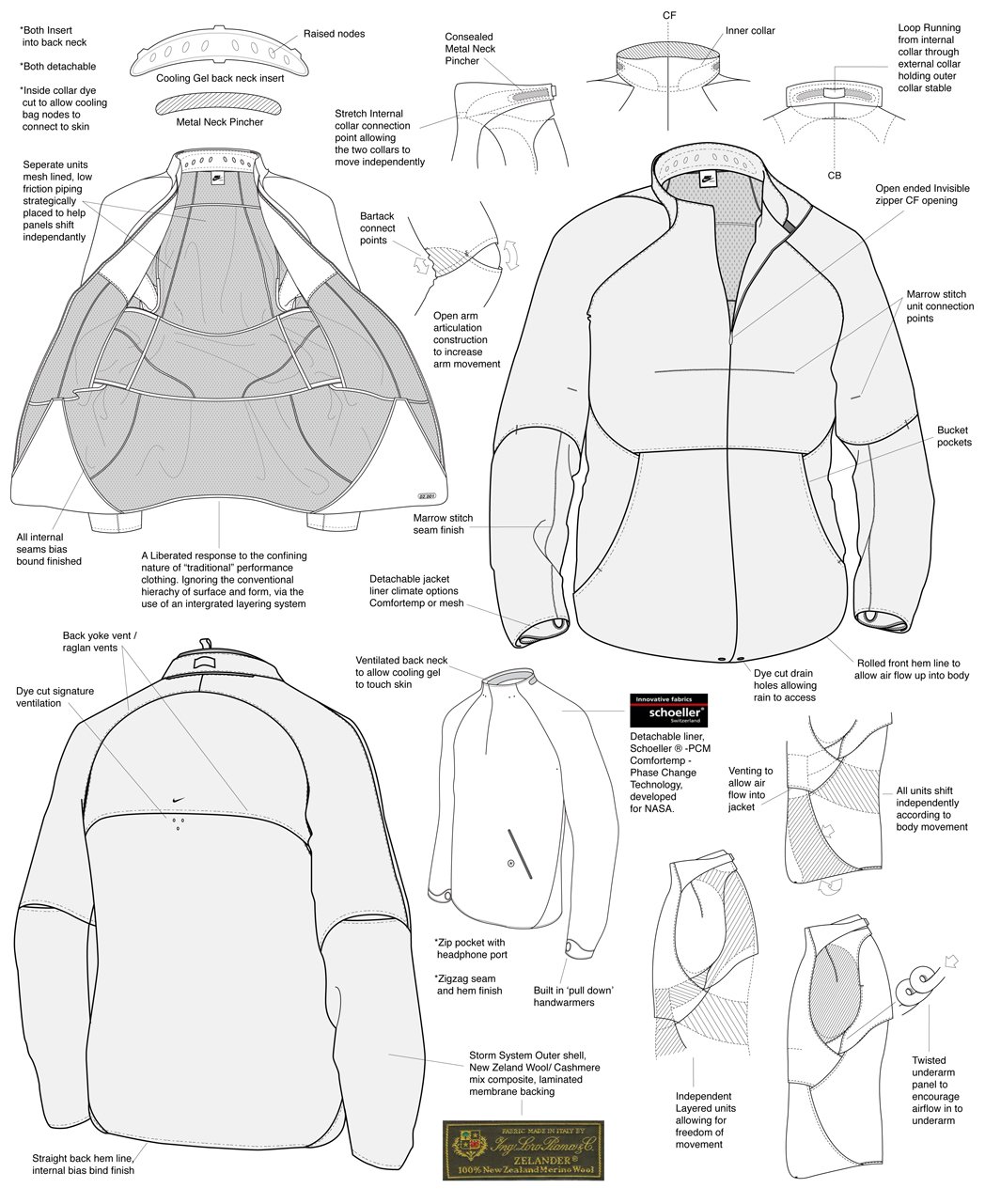
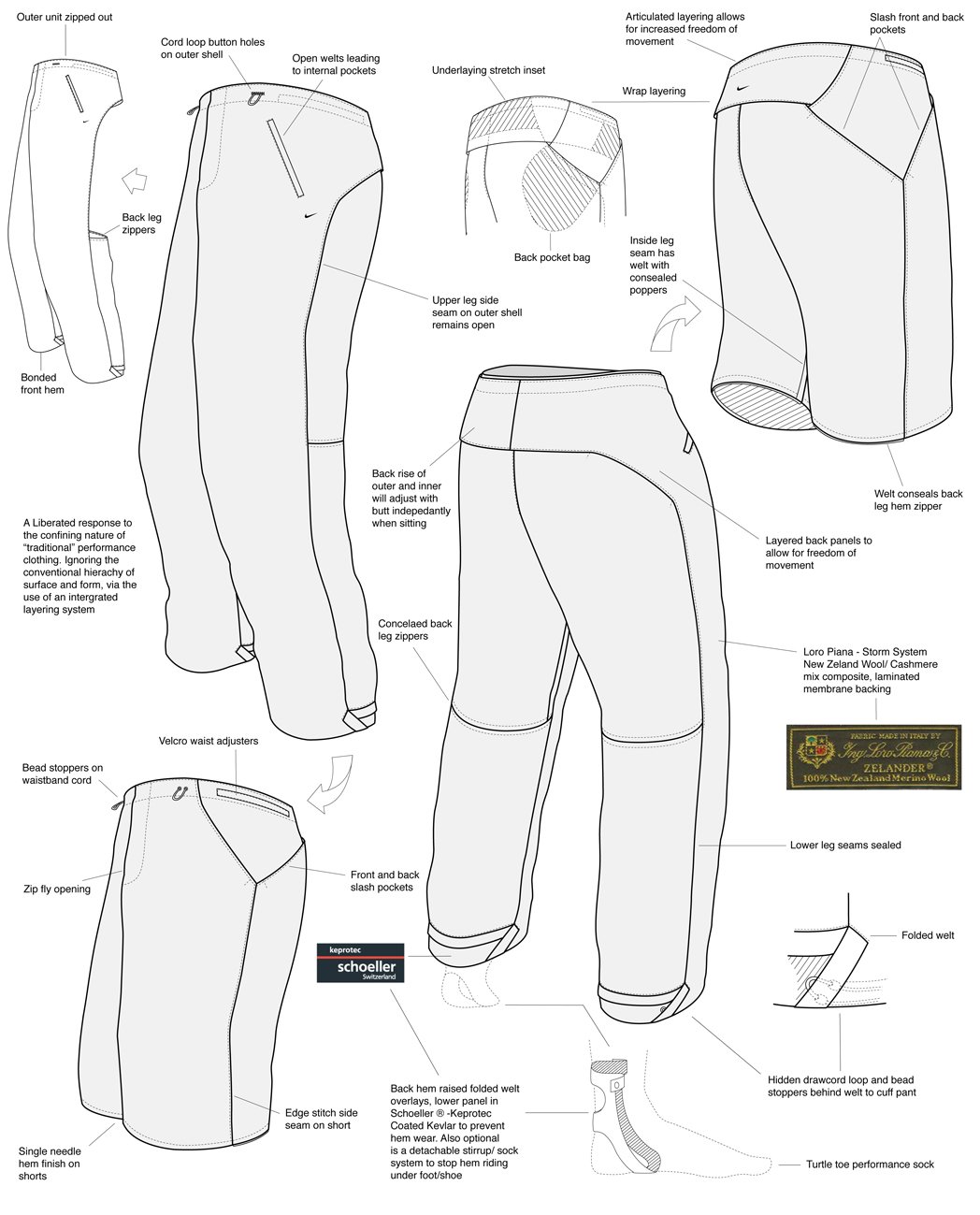
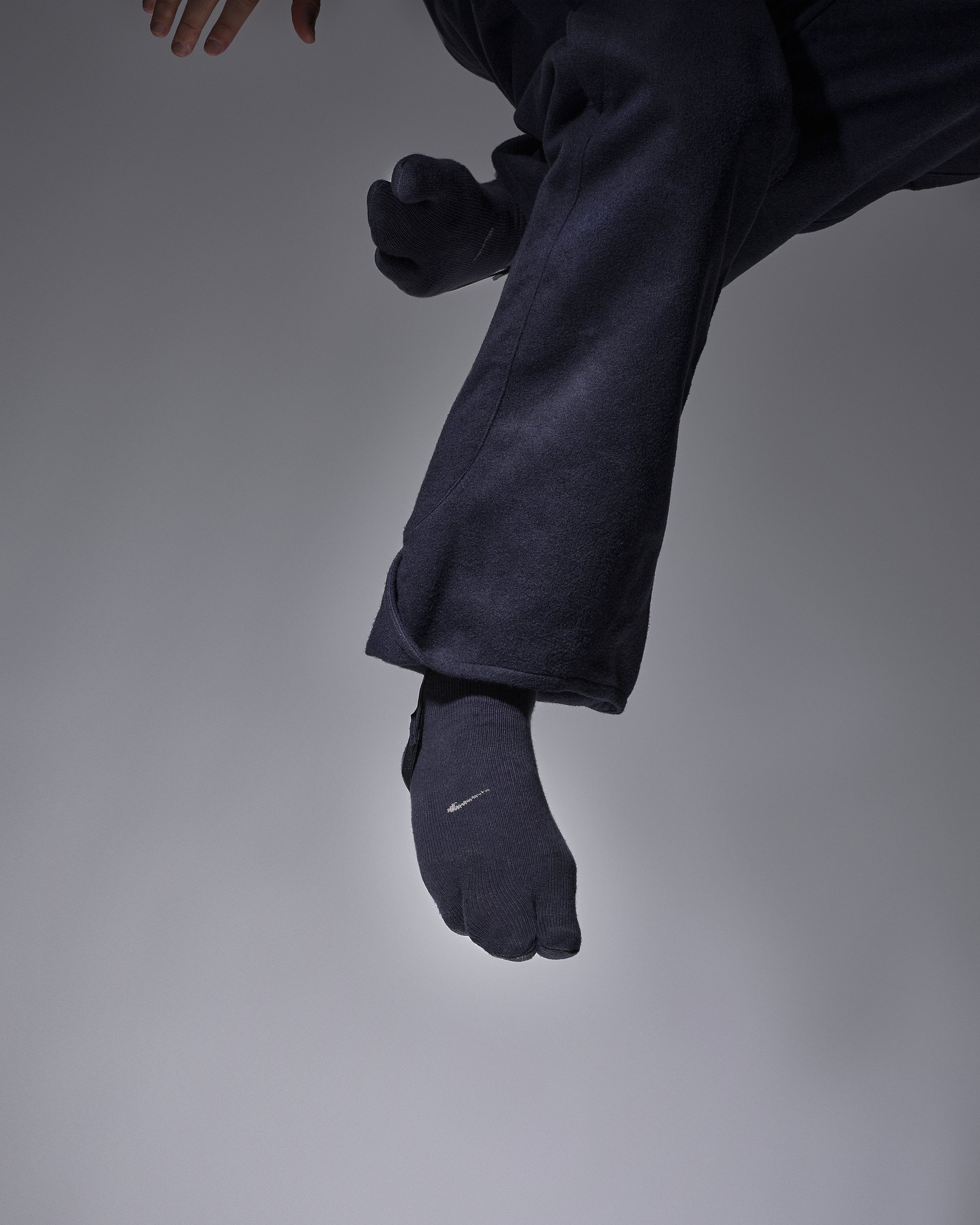
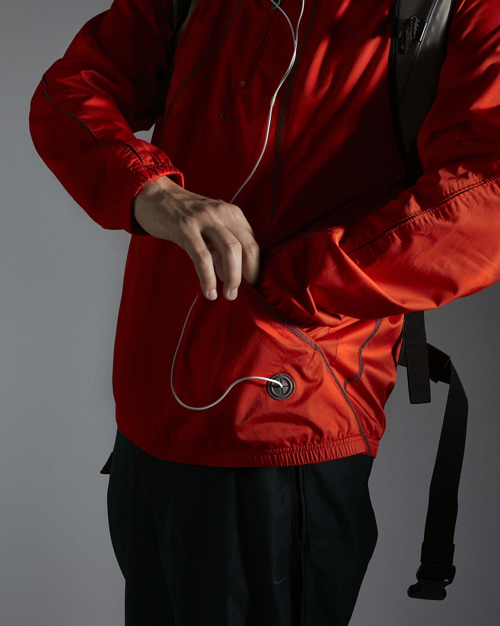
Standout archive pieces from the collection include the Code Mastercraft jacket with both summer and winter iterations, where the latter is made of Loro Piano wool and features an integrated layering system. All of the panels, of which there are tens [remember the difficulty for the panel cutter?], are elasticated and are designed to move and shift independently of one another, facilitating a wide degree of movement and body shapes. Other touches include hand warmers, the YKK invisible zipper, a multitude of breathable vents and even drains to direct water flow. The Mastercraft trousers replicate the variety of details - except they swap hand warmers for built-in swoosh-lined socks.

Louis Holsgrove Editorial Pics - Nike 01 Code Collection ‘Mastercraft’ Jacket and Trousers
Once you start to pick apart Spackman’s work, you can recognise his design signature with ease. There’s an abundance of two-way mesh pockets, MP3 slots, elasticated vents and unusually high necklines - the latter being one of the most obvious features. In the case of the Mastercraft jacket, the neckline conceals a detachable gel insert designed to cool down the neck via a series of raised nodes. “Anything I worked on at Nike”, says Spackman, “would have been a consideration for the athlete’s needs”, suggesting that form always follows function.
Louis Holsgrove Editorial Pics - Nike 01 Code Collection ‘Mastercraft’ Jacket and Trousers

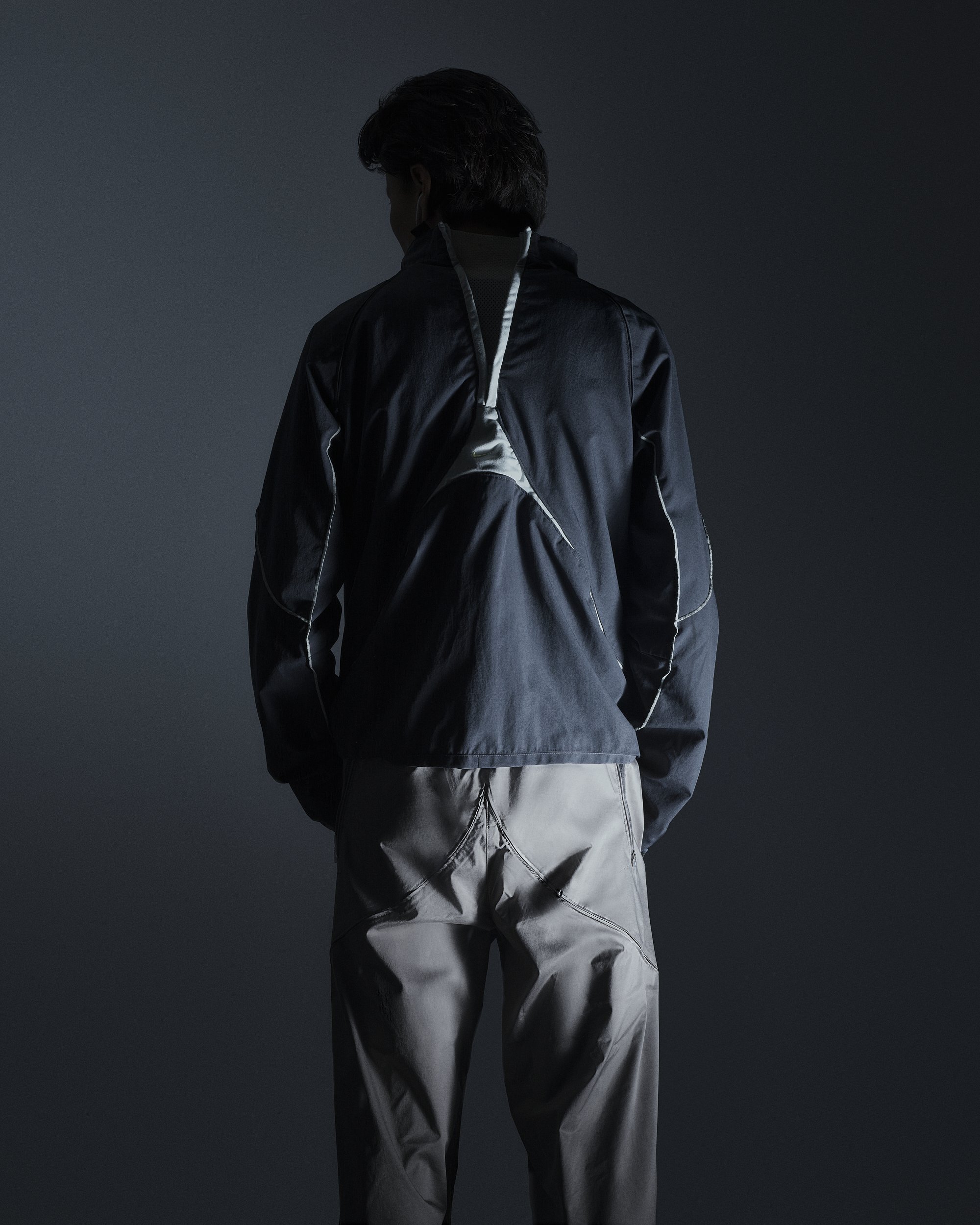
While Leenknegt and Spackman both describe the Mobius range as a more accessible version of Code, when you begin to go over the items, there are nuances that establish it as something else altogether. There’s an unnamed Mobius jacket [while Code pieces were given names, Mobius bits, to our knowledge, are not] seen in the picture below that features a triangular zipped mesh fasten on the back. It uses two different materials and colours to create an overlock that immediately stands out. The jacket is then elongated at the front and cropped at the back, giving the impression it’s reversed. It’s obvious that this style is something that has built upon Code, rather than just rehashing it at a lower price point. While Mobius was cheaper [the materials aren’t as luxurious, tending towards nylon and synthetic blends rather than wools], it still pushes the boundary of functional movement.

Louis Holsgrove Editorial - Nike Mobius ‘MB1’ Articulated Track Jacket

In this Instagram video, Holsgrove demonstrates a Mobius piece that takes inspiration from the Code Mastercraft lining, but builds upon it by adding an upper body layer with arm protection. Many pieces from both Code and Mobius are modular in this way, prompting Holsgrove to make a comparison to Yu-Gi-Oh: “these are the pieces that build Exodia. With the Mastercraft jacket, many of the elements are present in the other Code and Mobius items. The Code Mastercraft jacket might as well be Exodia.”

Louis Holsgrove Editorial Pics - Nike Mobius ‘MB1’ 2in1 Windrunner Jacket
Spackman’s influence was so great that copycats appeared. Pictured below are two jackets. The one on the right is the aforementioned unnamed jacket from the Mobius range, innovative in its use of a back-to-front inverted zip with elasticated paneling. On the left is a Levi’s Engineered Jeans Track Top, released in the late 2000s. Despite the similarities in shape and zip placement,, Spackman is humble: “All is love. Sharing is key, and everything is an open source as long as you manage to take it somewhere new.”


Levi’s Engineered Jeans Futuristic Panelled Track Top (Left) (images from @shop.allenreji)
Nike Mobius ‘MB1’ Articulated Track Jacket (Right) (images from @hol.sales)
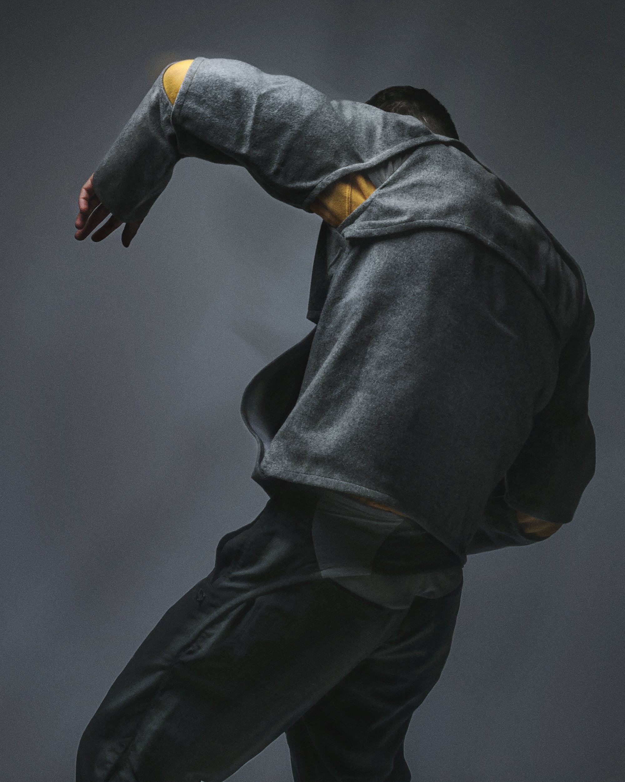
After these two ranges, Spackman worked on a multitude of other Nike projects, including React and Considered. Additionally, while Spackman doesn’t explicitly accept it [“I take that as a great compliment”], it’s easy to see how his output would’ve influenced the developments of Nike Gyakusou, and he admits that it was “something I wish I could have been involved in.” It’s likely that the earlier designers at Gyak would’ve built on the original sketches, work, and thought processes pioneered by Spackman.
Spackman also took the panelling and shapes of his explicitly athletic wear sketches and applied these to another domain: the blazer. In a wild Nike collab with Harris Tweed, Spackman put invisible zips and tension-easing vents in key places in a traditional tweed English blazer, demonstrating the adaptability of his work and cementing it as an exportable design philosophy rather than the features of a couple of one-off releases.

Louis Holsgrove Editorial Pics - Nike x Harris Tweed Footscape
Spackman is fully aware of the renewed interest in Mobius and Code in the modern-day, where various moodboards and Instagram pages like Organiclab.zip have dug up and shared his imagery. “Of course, it’s nice to see the appreciation out there for the projects we did at Nike. They actually have a much greater following now than they did back then, but socials allow creations from the past to flourish and be re-discovered. Times have just changed.”

Tony Spackman - Nike X Harris Tweed Line Drawings and Product Photos
When Spackman left Nike, he started his own project, The NON, which marks a distinct departure from his forays into areas of movement-focused techwear. The NON functions like an art project and the images from it are surreal, black and white delves into the depths of consciousness. If Spackman’s work at Nike is inseparable from the body - working with touch, shape and movement - then his output from The NON is inseparable from the mind, and works primarily with emotion and feeling.

Pics taken from ‘The Non’
The ‘Alchemia Mysteria’ range, released in SS11, channels Salvador Dali with strong stark figures, singular, pronounced trees, and mischievous, warped emotion. Another release, AW10’s ‘The Golden Dawn’ - presumably named after the Aleister Crowley-associated secret society - plays with occult motifs and symbolic iconography.


The NON is exactly the opposite of techwear, but it makes sense when considered as Spackman’s personal exploration into a world he hadn’t formally worked in yet. The variety showcases the range of Spackman’s creative thought. He describes The NON as an exercise in “full creative freedom. It picked up a niche following [before Instagram] online and became part of my ‘folio going forward. This was a crucial piece of the puzzle that opened up my doors to luxury and led me into that world of design.”

TONY SPACKMAN - CONCEPTS - MECHANICAL CONSTRAINT - SKETCH
The artistic vision of The NON, combined with the technical wisdom from Nike created the perfect backdrop for Spackman’s entry into high-fashion, and this led to his role as Design Director at Givenchy in 2013. He left this role in mid-2022, and has moved back to London after years of living abroad. “I’m about to start a new adventure,” he teases, but won't let on what it involves. We do know that it’s still high fashion, it’s most likely still under the LVMH umbrella, and presumably, must be based in London. Whatever it is, we’re keen to see what unexpected directions Spackman will take it in.
View the full editorial below


Text - Jacob Negus-Hill
Photographer - @stanley_everest
Stylist / Creative Direction / Interview - Louis Holsgrove
Styling / Creative Assistant @esornura


