Behind The Design: The Beginning of ASICS
In 1977 a great sports merger occurred between Onitsuka, GTO, and Jelenk who had for some time all been separate sporting brands, yet worked together through varied facets of sporting goods.
The three brands decided it was in their best interest to merge and become one brand for the future of the sporting goods industry and expand their product capabilities together as one. Their new brand would be based on the acronym ASICS from the Latin phrase [Anima Sana in Corpora Sano] meaning “A sound mind in a sound body”.
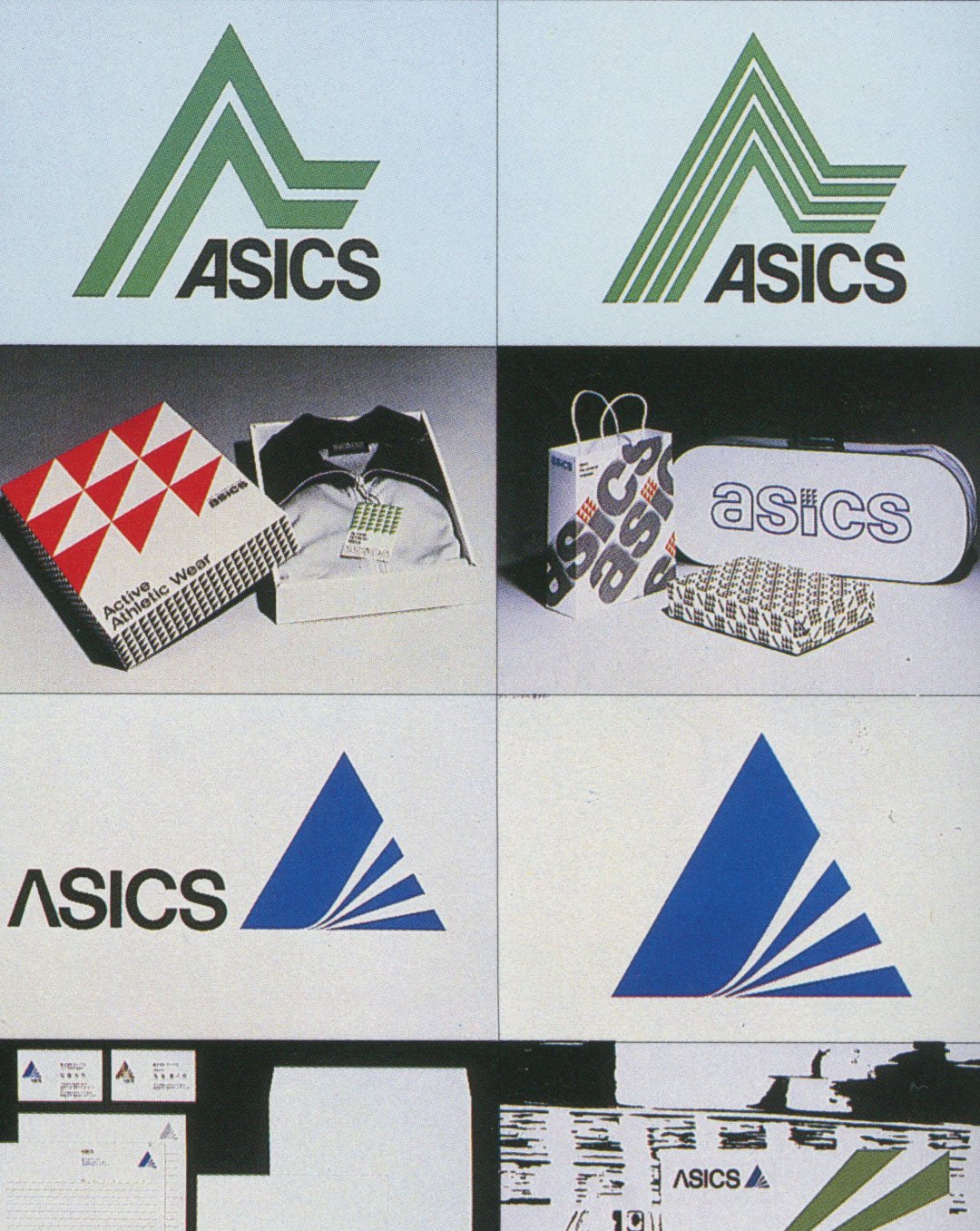
To decide the corporate identity [CI] program the newly merged partners held a design competition for selected agencies invited. The selected agency would be responsible for the CI design development and brand strategy. Progressive Artists Open System or [PAOS] design agency was one of the offices that submitted six different designs based on one concept, which they won.
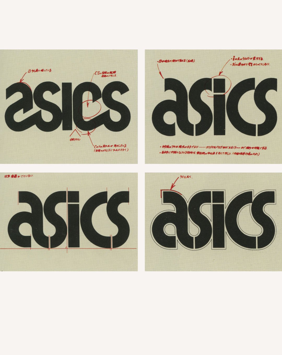
PAOS would assign Herb Lubalin a well-known and famous corporate identity designer, to design the core elements of the logotype system and establish implementation on the brand usage. Lubalin initially came up with seventeen different design concepts, two of which were chosen and further refined.
The brand name was also expanded with implementation to further include the product brand names of the successful product lines i.e TIGER, GTO, and golf brand on new merchandise.
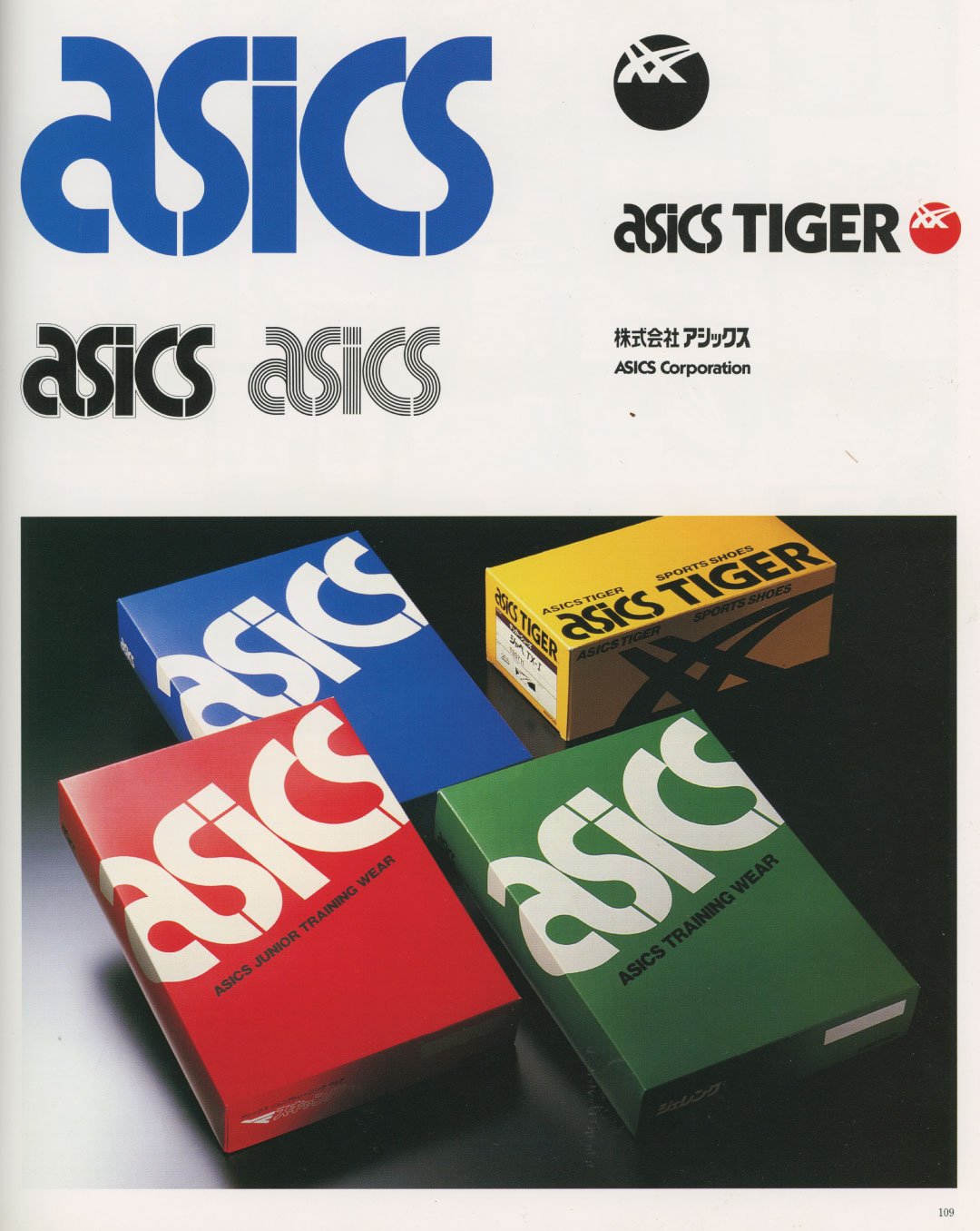
Moreover, the ASICS TIGER logo also underwent a completely new re-design which included new emblems, colours, and other flexible elements that could be established to handle challenges that the new brand name would cover. Ultimately, allowing the ASICS brand to be perceived as a “world-class” sporting brand.
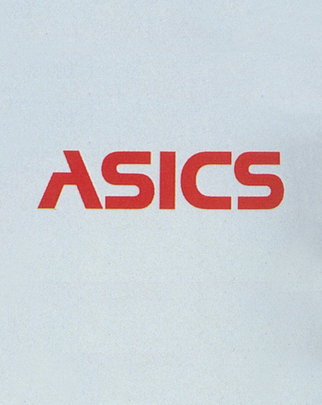
Take a look through the images to uncover some of the design concept development. Through some of the images, you can look at some of the initial competition concepts by PAOS. Also, be sure to look at the refinement process from Lubalin's adopted design direction and feedback for finalization.
Text:Mr.X


