Behind The Design: Nintendo Console Logos
Many can remember that nostalgic childhood moment discovering for the first time that new word “Nintendo”.
Seeing it appear on the television with new excitement, and watching a little figure jump through a different universe whether it's Mario, Kirby, Zelda, etc... Wanting to experience it, kids saved for one or were lucky to get a console as a gift. Because we all experienced that moment at different times Sabukaru has decided to take a look at “Behind the Design” of some of Nintendo’s most iconic, yet memorable console identities.

Despite Nintendo being incredibly secretive about the inner workings of their highly successful and intelligent branding/identity work, it’s likely done in-house although we can’t confirm it.In any case we feel that Nintendo’s consoles maintain a particular past-time nostalgia that deserves time and mention.

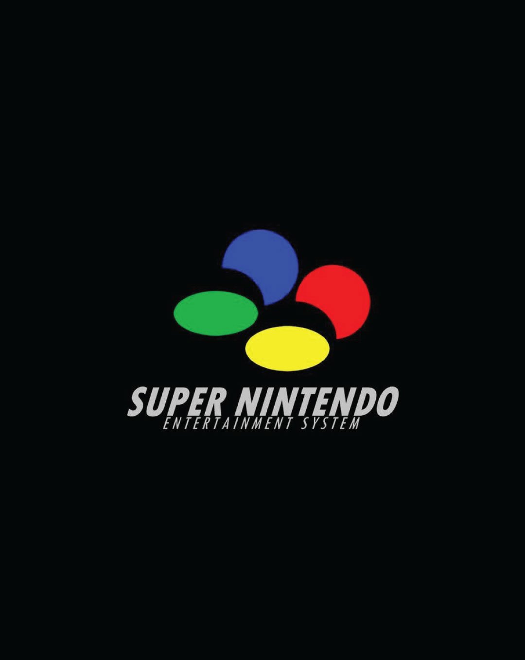
Those lucky enough to experience 1991 SNES Nintendo [Super Nintendo Entertainment System] the four-colour oval identity was in part designed around the Japanese PAL regions [Asia, Africa, Europe, Oceania, South-America]. The colours correspond to the ABXY on the controller for each region. North America however, was composed of a striped rectangle background with oval shapes cut out and carved strip.
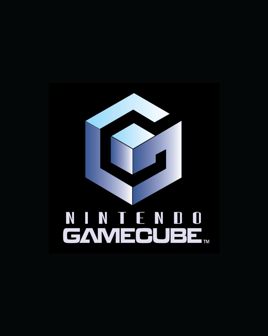
In 1995-1996 Nintendo N64 was released, and the identity spawned a new venture with it being a 3D rendered logo-mark. Consisting of 64 sides [planes] to create the signature identity. Continuing on a similar path the 2001 Gamecube mark was designed with its evocative radiating violet-silver symbol which maintains a cube form. Additionally, the G letter is visible and enclosed with the C form through its geometric negative space assembly. The symbol was technical and strong with a togetherness that retained simple modernity.


While the Gameboy was a far more democratic small mobile handheld it ultimately cast a line into mobile gaming. As a nod to this era, a couple of marks worth mentioning would be the 1998 Gameboy Color, where the word “Color” utilizes the same colours of the handheld devices in a typeface similar to Comic Sans. The later simplified mark would be the Gameboy Advance from 2001, designed with the same blue colour as Mario Bros. edition [Glacier with Mario].

Text:Mr.X