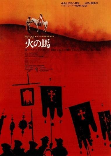
Designing For The Blockbusters: Meet Movie Poster Designer, Kiroku Higaki

There was a time when a movie poster could define the future of a film. A good poster could attract fans to the cinema, yet a great poster could become a piece of pop culture on its own. For Japanese cinephiles of the mid-20th Century, movie posters were even more important, as it was their job to break down the cultural and language barriers that separated them from other blockbusters around the world.
Kiroku Higaki knew this better than anyone else as he, for more than 60 years, designed, redesigned and adapted the posters of the biggest Hollywood hits for Japanese audiences.

Logo design for Gremlins 2 [1990]
Kiroku Higaki, a cinephile born in 1940, in Tokuyama City [now Shūnan], Yamaguchi Prefecture, began studying engineering at the Osaka Institute of Technology with the purpose of joining Takenaka Corporation, the most important construction company in Japan. However, given his poor math skills, one of his teachers suggested that it would be a good idea to consult with his parents and change his career path to do something else.

Poster and logo design for Project A [1983]
Higaki was always curious about design. Although he didn't know much about it, other than Saul Bass' work, he already had some experience with design: a poster design contest for the athletics club of his high school and a part-time job at a shop making signboards for businesses. Having that curiosity and little experience in mind, he decided to enter Central School of Fine Arts in Tokyo, where its design program was established in 1957, just a year before he was admitted.

Logo design for Beetlejuice [1988]
In 1958, the annual number of moviegoers in Japan peaked at 1.1 billion, where on average, the entire population of the country of the time [approx. 92 million] went to the movies once a month. An unthinkable ratio nowadays. In this environment, foreign and Japanese movie studios and distributors, led by Towa Co. Ltd [renamed in 1975 as Toho-Towa], Tohokushinsha Co., and Shochiku, enjoyed the reign over the cinema industry as the top entertainment media. But their dominance came to an end with the introduction of the television, which that same year reached a million units in sales and for the following, would snatch nearly 500 million viewers from the theatres.

Logo design for Honey I Shrunk The Kids [1989]
The growing entertainment industry led by television and the development of new products and services, pushed all types of entertainment businesses to look for more attractive forms of promotion and advertising, followed by a growing need for design.
In 1959, Japan experienced a design boom, mainly due to the confirmation of the Tokyo 1964 Summer Olympics, which would be the first to be held in Asia. Being the first to be broadcasted worldwide in color TV via satellite, and, most importantly, the perfect chance for the country to showcase Japanese innovation across all creative disciplines on a global platform. Japan had the chance to shape a new identity that would leave the events of WWII behind.
Poster design for Three Days of the Condor [1975]
In technology and urban development, the Tōkaidō Shinkansen project and the futuristic elevated highways. In architecture, the Yoyogi National Gymnasium, designed by Tange Kenzō, and in graphic design, the iconic Tokyo Olympics logo designed by Yusaku Kamekura, were examples of the new modern identity that Japan sought to convey to the world.
That same year, Japan’s top designers, photographers, and copywriters [among them, Yusaku Kamekura and Hiromu Hara], sponsored by the most important companies [Asahi Breweries, Asahi Kasei, Nippon Steel, Toshiba, Toyota Motor, Nikon, NKK, Nomura Securities] formed the Nippon Design Center [NDC], an organization that aims to develop and improve the quality of Japanese advertising on a large scale. The NDC was officially established in March 1960 and cooperated in designing the identity of each of the 1964 Olympics events.
These events, along with the 1960 World Design Conference, held in Tokyo, established Japan as a new global design epicenter. Kiroku Higaki being a design student himself, suddenly was in the front row of the new need for design happening in every industry, one of them being, Cinema.
Poster design for The Burning [1981]
Still, in 1959, the NCC [Nippon Cinema Corporation], an independent film distribution company founded in 1948, hired Kiroku Higaki as an intern of its promotion team, working on newsletters and ads for the magazine "Screen". Even though it was a part-time job, NCC [which in 1961 was bought by Kadokawa Herald Pictures] provided him with the opportunity to work in the industry from day one.
The next year, in 1960, Nobuhiro Tachibana, the head of the advertising division at NCC, wrote a letter of recommendation for Higaki, but he still had to pass an interview and a test to enter Toho-Towa. The interview never happened, but he did take the test, consisting in designing a newspaper ad for the movie, The Lost Alibi [黒い画集, 1960]. However, he did not receive any response from the company about the results.
Logo design for Blade Runner [1982]
After a couple of weeks, Higaki went to Toho-Towa to ask for them, and that’s when he met legendary movie poster designer known for his calligraphy, Susumu Masukawa who informed him that he didn’t receive a proper response because he was on a business trip in Takarazuka and put him to work immediately. Just like that, he became a designer at the number one company in the Japanese cinema industry, Toho-Towa, and was assigned to their top design team with Masukawa himself, who became his new mentor and boss alongside the distinguished illustrator, Shin Nakamura.
His new job at Toho-Towa would coincide with the creation of the Toho Art Bureau, preceded by his boss, Susumu Masukawa, an area specialized in the design and promotion of Toho films. His first task at the studio was to cut still frames from the film Desperado Outpost [独立愚連隊, 1959].
Logo design for Desperado Outpost [1959]
Before Toho Art Bureau, not all posters were produced in color and photomontage was heavily underused. So although Higaki did not plan for this, he would eventually come to develop the blueprint of the “Toho-Tawa graphic style” of movie posters.
During the first half of the 60s, under the guidance of Susumu Masukawa, Artistic Director of Toho-Towa, Higaki polished his design skills. At this point, he didn’t make any movie logos yet [that was a job still reserved for his master], but he became highly skilled in photomontage and composition. This is particularly notable in his Spaghetti Western works of the time.
A Western is a movie set in the second half of the 19th Century in the Western US. While, Spaghetti Western, is the term used to describe movies that were made in European countries [especially, Italy, because it was cheaper to make films there], during the early ’60s to early ’70s but remained close to the American west, both in theme and aesthetic. A Western and a Spaghetti Western are essentially the same thing but differ in where the movies are made.
Logo design for How the West Was Won [1962]
This particular genre can be seen as one of the first iterations of action movies, heavily using the figure of a hero, a villain, and the conflict between them. That is why it was perfect for young poster designers such as Higaki to improve their technique because all the elements to make a great poster were already there.
At this early stage of his career, two works would heavily influence his style, the poster of Akira Kurosawa's classic, Yojimbo [用心棒, 1961] that he designed alongside his mentor and the poster for Sergio Corbucci's DJANGO [1966], a re-interpretation of Yojimbo. Using the experience that both works provided him, Kiroku Higaki cemented his position as a trusted designer of blockbuster films, working for the DJANGO saga well into the beginning of the 70s.
Designing a movie poster at the time was a slow process, especially in countries like Japan. Studios in Hollywood and other parts of the world provided distributors with a limited number of design resources, like photos of actors and actresses, images of official props, and color palettes. Asking for more resources was also off the table, as movie stars only worked with a small circle of certified photographers whose work was incredibly expensive. And oftentimes, the prop images studios sent over were useless, and obviously, asking for different ones came at a price.
For these reasons, designers constantly had to overcome challenges by using still frames from trailers and pre-screening copies, and making and shooting props themselves. Yet, the logo design was the trickiest part, since they had to adapt the title to a totally different writing system, without leaving aesthetics and cultural needs behind. Making a poster was critical for a movie in many ways but still, it was the last step in a long and complex promotional process.
Kiroku Higaki working on his ‘storm’ effect, 2020, photo by Ishibashi Toshiharu
The promotion and distribution of foreign films in mid-20th Century Japan was an artisan work based almost entirely on the intuition of the distribution companies and their leaders. Japanese production companies acting as distributors, bought theatrical screening rights from foreign studios in Hollywood, based on closed-door screenings of the films reserved for “staff members” only and Chief Officers [President, Vice-President and General Managers of Distribution and Advertisement] had the last word. If a movie seemed to have the potential to be a success at the box office, the screening rights were bought, if not, the film might never be released.
However, Toho-Towa was interested in creating new and loyal audiences, even with films that were classified as artistic and not necessarily successful. That is why, in 1961, they created the ATG [Art Theater Guild], a limited distribution division for these types of movies. Through this, beginning in 1996, Kiroku Higaki would work as the lead designer, allowing him to experiment with new techniques and themes.
Poster design for Marat Sade [1967]
Far from the economic pretensions and guidelines especially set by American studios, ATG offered Higaki the creative freedom that working with mainstream films did not provide. His work didn’t even require approval from his mentor, Susumu Masukawa.
Therefore, Higaki was able to practice experimental and bold design techniques and themes [“pure design”, as he named them] applied to posters for alternative movies, instead of the standardized mainstream movie poster design, ruled by profitability requirements.

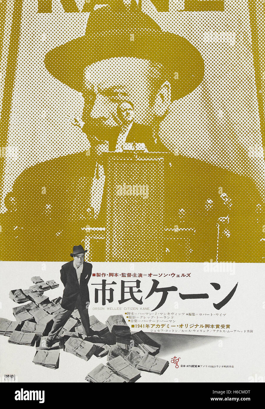
During his time at ATG, Higaki showed his skill to successfully portray abstract imagery, as proven in his poster for the documentary Loin du Vietman [1967], in which he uses fighter jets as the symbol of the United States instead of the traditional stars. As well as, his work for the classic, Citizen Kane [1941 released in Japan in 1966] where he used a halftone effect, to make it look like a newspaper and allude to the journalistic theme of the story.
But above all, there are three posters of this period that became a staple of his pushing forward approach to poster design: The “ATG trilogy”, three cult classic movies distributed by ATG that although not related to each other, shared a common poster design language, that is, black and white images with a solid color. The movies of the trilogy are Shadows of Forgotten Ancestors [1966, 1969], Procès de Jeanne d'Arc, [1962, 1969], and Au Hasard Balthazar [1966, 1970].
Poster for Procés de Jeanne d’Arc [1921,1969]
Poster for Shadows of Forgotten Ancestors [1966,1969]
Up to this point, Kiroku Higaki, nicknamed "63" [due to the pronunciation of the number 6, "roku" and 3, "san" which also sounds as the honorific], was mostly working on western and cult films. But in 1972, he landed his first chief designer role for a major mainstream movie with Clint Eastwood’s massive hit, Dirty Harry, where he designed a logo for the movie all by himself for the first time. Since Higaki didn’t know what the word ‘dirty’ meant, he looked up the word in the dictionary and decided the rough Yojimbo logo art style, previously designed by his mentor, Susumu Masukawa would be appropriate. Then, he wrote the title of the film on a paper sheet with a brush, managing to turn Clint Eastwood into an urban detective version of Yojimbo. The poster was well received by the audience and particularly by Shoji Sato, Director of Advertising at Warner Brothers
At that time, distribution rights of films from American studios were bound to exclusivity agreements. Therefore, Toho-Towa could not show films belonging to Universal or Paramount Pictures, while other studios could not distribute films from Warner Brothers, since they maintained a contract with Toho-Towa. That is why Kiroku Higaki’s professional relationship with Shoji Sato was key to his career since he would be in charge of commissioning all of WB's advertising works from the early 70s to the late 90s, which have decoded the visual culture of a cinephile nation.
More than 600 posters [over 220 from Warner Brothers movies] and 62 years after his first day at Toho-Towa, Kiroku Higaki continues translating language, meaning, and visual codes of foreign movies for Japanese audiences, one poster at a time.
His work has influenced and impacted pop culture worldwide, navigated through styles, trends, and cultural barriers, and left an indelible mark on cinematography history, but even after an incredible career, he’s nowhere near done, Kiroku Higaki is not retired and doesn’t have plans to do it.
A selection of Kiroku Higaki works through the years
The Exorcist [Released in Japan in 1974]
When he designed the Japanese logo for The Exorcist, Higaki was unaware that the original logo was purple and no instructions were given by Warner Brothers to make it purple.
But he still had to use color for the logo and posters. Higaki thought that, in Japan, if someone is possessed by the Devil, a Buddhist monk should exorcise the demon and the highest Buddhist monks wear a red robe, so he went with it.
However, red did not convince him, so he used the famous Buddhist priest from Hyakunin Isshu's poems, Semimaru, traditionally depicted in a purple robe, as his reference. Surprisingly enough, it was the same color as the US logo.
Clockwork Orange [1972]
Warner Brothers specifically asked foreign distributors to make the logo for Clockwork Orange as close as possible to the original one. For Japan, that was a major challenge, since the written translation 時計じかけのオレンジ [Tōkejikake no orenji], contains both katakana and hiragana and kanji characters all merged together in a single title.
Higaki achieved the goal by rounding off the radical 日 in 時 and lengthening the third stroke of オ, like a “foxtail”.
Relatively early in his career, this logo remains one of the most complex logos in his portfolio, even to this day.
Enter the Dragon [1975]
There are two typefaces in the logo of the classic Bruce Lee movie, the first one made with brush strokes and the second one, made with outline characters
While designing it, Higaki had a 39°C [103°F] fever, he started the logo with a brush and completed 燃えよ with it, but couldn't continue for ドラゴン, so he dropped the brush and used outline characters instead, because he thought it was easier that way.
The Big Boss [1974]
At that time, showing the protagonist of a film several times in a poster was not well seen.
According to Higaki, there were only two actors with whom you could apply that composition technique: Charles Chaplin and Bruce Lee.
In this poster for The Big Boss, he tapped into the Kung-fu moves that made Bruce Lee a global phenomenon and one of the most beloved actors of the past Century.
After this, Higaki designed all of Bruce Lee movie posters for the Japanese market and it was with these movie series that he gained the total trust of Warner Brothers.
Papillon [1973]
The knife and hand holding it are not Steve McQueen's, it is Kiroku Higaki's hand holding a knife he bought at Ameya-Yokochō. He tried to use a still frame from the movie where a knife is shown but couldn’t catch a good angle of it, so he improvised. The chain that circles the characters is a drawing by Higaki himself.
This poster belongs to the Cinerama [シネラマ] movie complexes. Movie theaters with four projectors connected together to form a curved screen, were quite revolutionary at the time.
Logo design by Susumu Masukawa, Composition by Kiroku Higaki.
Tightrope [1984]
Higaki based his composition on the original American poster, but added his hand holding a prop gun, bright red, a totally different logo and a city in the background to meet the audience's expectations of a Clint Eastwood movie.
This wasn’t the only poster for this film in which he used those over-the-top composition techniques.
Blade Runner [1982]
The poster for Blade Runner meant one of Higaki's greatest hits, as it was adopted as a "world pattern" by foreign distributors outside Japan. Basically, it was preferred by production companies all over Europe over the original American design.
He decided to use gold as the primary color, because Star Wars [not distributed by Toho-Towa], used blue as the primary color and did not want to compete directly with it.
Higaki thought that Blade Runner would become a movie series, so he tried to “sell” Harrison Ford as an action hero like he did with DJANGO and will do later in his career with Die Hard.
Terminator [1985]
For the poster for Arnold Schwarzenegger's Terminator, Higaki used his Blade Runner work as a reference. Especially in the logo design where the central vertical axis extends to infinity. This trope, popularized by Star Wars, often expresses futurism and science fiction.
The photograph behind the title looks like a still frame from the movie but even though it is part of the movie indeed, they are actually two frames carefully mixed together.
The Cannonball Run [1981]
In the early 1980s, Toho-Towa had to compete not only against rival studios and television but also with the growing number of stores and boutiques that took the attention of the audience on the streets. That's why posters with huge logos [called “Ben-Hur logos” in the industry, after the iconic 1959 film poster], became popular. The poster for The Cannonball Run was one of Higaki's favorites, as it not only contained a massive iconic logo, but also the "exploding" composition that he would constantly use that decade. The illustrations accompanying the logo were done by Shin Nakamura, a longtime collaborator of Higaki and Toho-Towa.
First Blood [1982]
Following the style developed in The Cannonball Run, the poster for First Blood uses a Ben-Hur-style logo and illustrations by Shin Nakamura.
The title, like in many other countries around the world, is confused with "Rambo", likewise, a mix of American cities appears behind Stallone, but the events of the movie do not take place in any major city.
Suspiria [1977]
Redesigning the iconic logo for Dario Argento's Suspiria was tricky, however, Kiroku Higaki successfully adapted the "wavy" letters to katakana, this title style would become really important for his own work with horror-themed movies.
For the poster, he kept the iconic illustration of the original design, colored bright green a still frame of Jessica Harper, and used yellow for the logo. He was looking for a strong contrast.
As he puts it, “the color palette was closer to the Chinese traditional design than to European horror cinema” but it worked well.
Zombi 2 [Released in Japan in 1980]
For the poster for the cult movie, Zombi 2, Higaki wasn’t informed about the plot of it, he didn’t even watch a trailer, all he knew is that it was a zombie movie that happened in New York, so he went with his gut and decided to give it the aesthetics of Suspiria, with the logo, the colors and a photo of the city.
Sanguelia was the title that Toho-Towa decided for the film in Japan against the desires of the producers in Italy, which caused conflict between them. On top of that, there are two logos in the poster, Higaki’s and the one designed by Susumu Masukawa, written in English.
Batman [1989]
Like with Clockwork Orange, Warner Brothers and DC, ordered foreign studios to design Batman's logo the closest to the original one. His relationship with the superhero genre began a decade earlier, with the design of the iconic logo and poster for Superman [1979].
Die Hard [1989]
When Die Hard premiered, Bruce Willis wasn’t associated with action movies, since he debuted just a year before in the romcom Blind Date. Because of that, producers weren’t sure about using his face on the poster, that’s why the first version of it didn’t show his face at all.
Once Die Hard became a box office hit, 20th Century Fox ordered a new design for the movie. Kiroku Higaki using his knowledge of “selling” protagonists that DJANGO and Blade Runner taught him, heavily pushed Willis in his poster.
The design was exactly what the studio wanted and became "world pattern", used even in the United States as the official poster.
Empire of the Sun [1989]
Higaki rarely watched the films he was designing for, he didn't have time to do it, he relied on trailers, their plots and the graphic material studios gave him to work.
Empire of the Sun was an exception. He lived his childhood during WWII and was part of the first generation of Japanese children that had the opportunity to go to school after the war ended. Because of that, he deeply identified with the protagonist, a British kid trapped in China during the Japanese occupation and WWII.
These personal feelings are depicted in the poster of Empire of the Sun, where he merged together two different scenes of the movie to make a touching composition that remains his favorite work to date.
About the Author:
Leonel Martínez is a social media consultant and a writer living in Mexico City. Japanese culture, graphic design and art aficionado. Describes himself as a "cultural worker".


